Meet the widgets
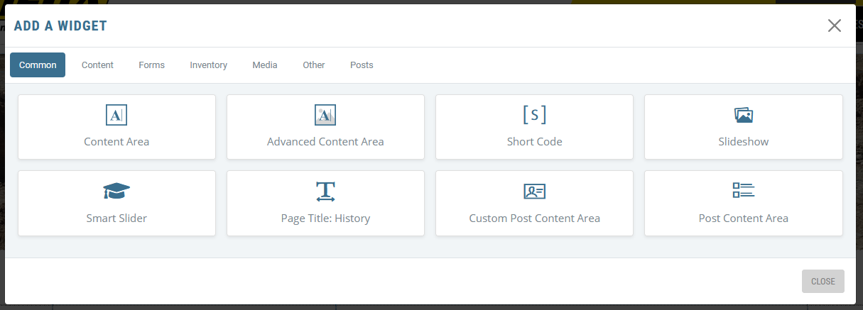
When you click the ADD A WIDGET button, you will get a pop-up that is divided into tabs that house different groups of widgets. We are constantly developing widgets, so don’t be surprised when new ones pop up. The basic widget tabs we have right now are:
Common widgets are the most popular widgets accross the platform. These are the highlights of the different categories repeated for ease of access. These primarily consist of editable areas and common elements used to add content to pages.
Content Widgets
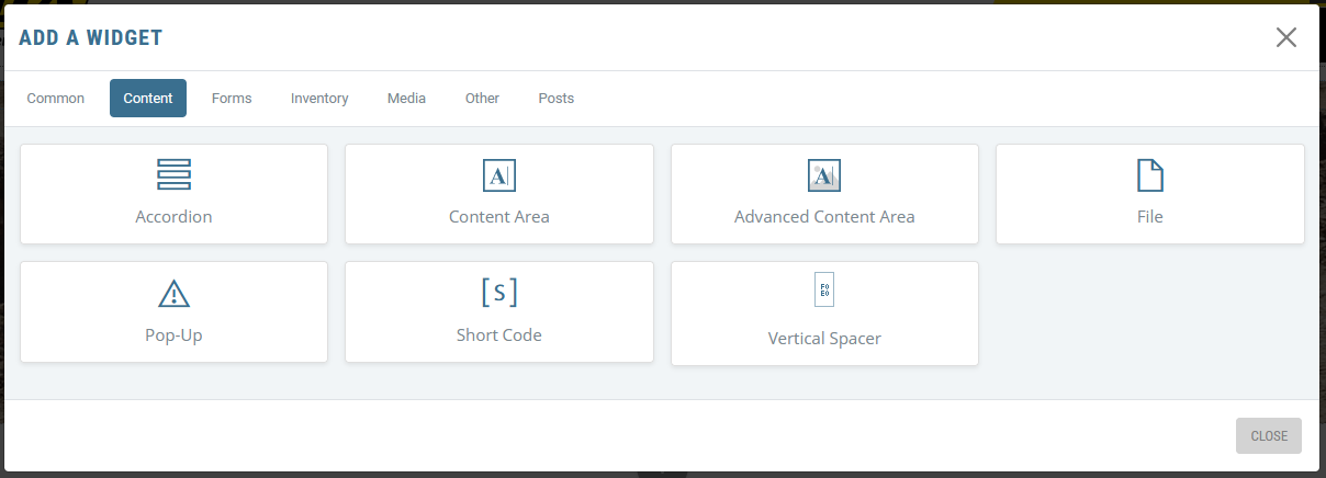
Content widgets are the most commonly used widgets. The big ones are the Content Area and the Advanced Content Area widgets. These are the widgets that allow you to have editable regions that trigger the editor itself. These can hold text, images, videos, etc.
Content Area Widget
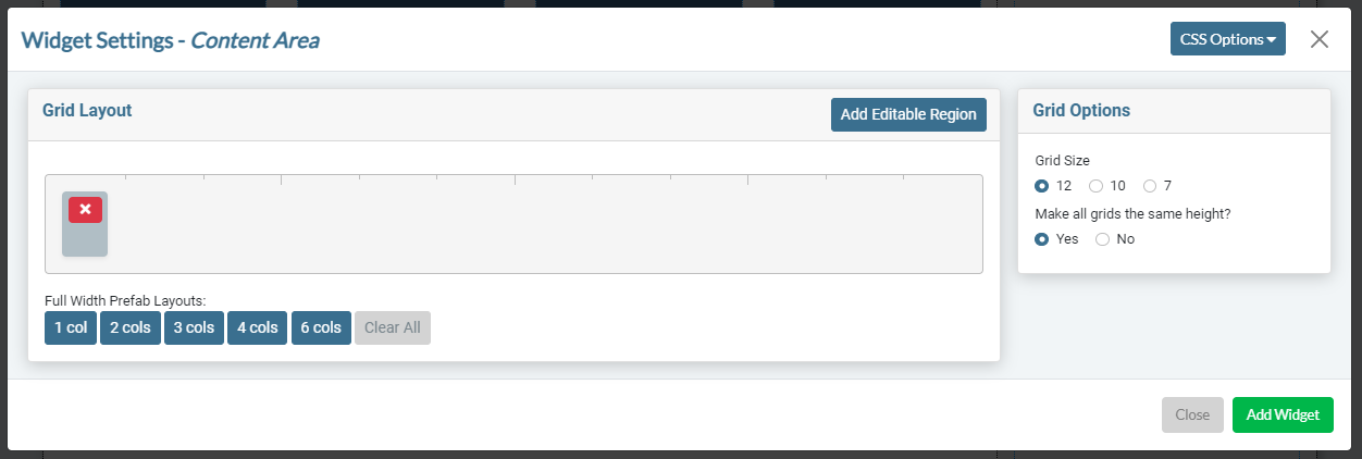
This widget adds fully editable regions with no backgrounds or special classing (other than the CSS Option tab). It is the perfect choice for most standard content areas.
These fully editable regions allow you to add text, photos, videos, links, tables, or anything else you want. You can use the full Sandhills Editor to add any content, media or HTML.
When you first go to add a new Content Area widget, the first Editable Region is inserted in the settings by default. Click the “Add Editable Region” button to add additional Editable Regions to the widget as necessary.
When first added, they will only be one column wide. You can resize the Editable Region by dragging the lower right corner to the correct size. You may move it anywhere in the 12 column grid by dragging it to that position. The Editor will also allow empty spaces around a defined Editable Region if your design calls for that. These empty areas will follow the 12-column grid as if they were defined by an empty Editable Region.
Editable Regions only expand to the right. If you need to make a left-side Editable Region bigger, move the Editable Region on the right side to the correct starting position, then expand the left Editable Region to the correct sizes.
- Full Width Prefab Layouts
If you just need a multiple column layout, you can click the corresponding button and it will create the editable Regions for you, equally sized and spaced in the Content Area. Once added, they can be resized like normal.
- Grid Size
Each Editable area is 12 columns in width by default and can be subdivided by adding more editable areas. Twelve columns is the most flexible grid system as you can choose to have 1,2,3,4,6, or 12 equal size (or unequal size) editable regions. If you do need an odd number like 5 or 7, you may change the grid structure by selecting the appropriate option. Each editable area is mobile responsive and will stack in the current order on mobile devices.
- Make all grids the same height?
This uses Javascript to set the height of each Editable Region so that all of the regions are expanded to the same height as the tallest region in the widget. This is great for graphical 3 or 4 column rows. Same height does not apply to the stacked mobile (XS) breakpoints.
Advanced Content Widget
This is by far the most flexible and powerful tool in the arsenal. It’s a little more complex, but once you understand how it works you can do almost anything you can think of with this tool.
The Grid Pane
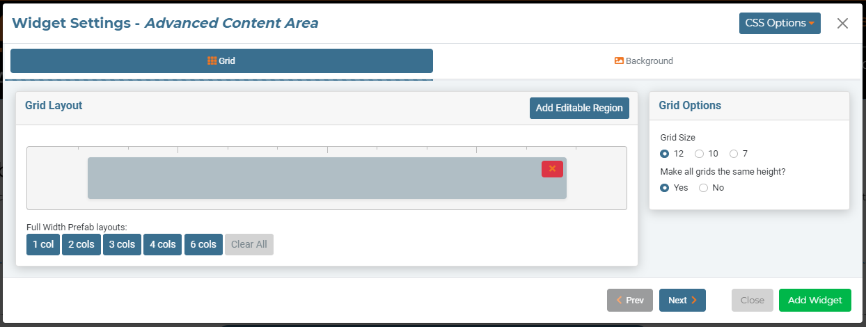
This is a two part tool. The first screen is almost identical to the standard Editable Area widget. You set up the grid of content areas on this first screen.
- Full Width Prefab Layouts give you a quick way to add the correct number of columns to your Grid Layout. These will be equally sized across the area. Once added, you can still change their widths to meet your needs.
- If you'd like to configure the editable regions manually, just click The ADD EDITABLE REGION button until you have the number of areas your want. Then then drag them to the correct positions and adjust their widths.
- Once you have the correct number of Editable Regions, drag them to the correct widths. They will snap to the grid size chosen.
- Choose a Grid Size. Usually, you will leave this at 12 since it is the most flexible.
- Lastly, choose whether you need them to be the same-height or not.
- When you are done, click the blue NEXT button.
The Background Pane
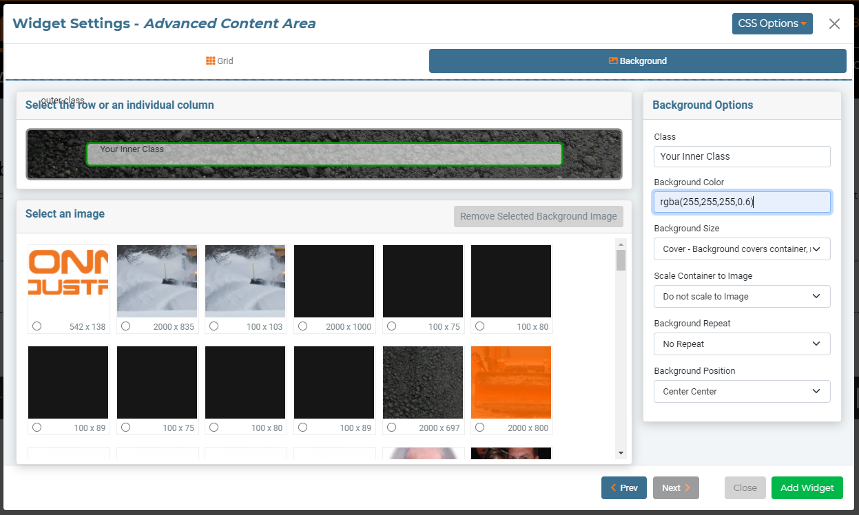
This screen is where the magic happens. Here you can add all sorts of stuff. You can assign custom classes to your Editable Regions, add background images, set how the regions behave with the background image, and all sorts of other cool stuff. The best part is you can do this for both the individual Editable Regions and the rows that contains those Editable Regions. This makes it extremely easy to layer backgrounds to create different effects.
- The Rows and Columns
At the top is a graphical representation of all the Widget’s areas. Both the outer row and each editable region inside it are independent and can all have completely different backgrounds, classes, and settings. Because the background container (row) is the containing element, the choices you select for each internal Editable Region (column) can affect the background as well (and vice versa).
To add a background image, just click on the correct row or column from the representation at the top of the window. The border will turn green to show it is active.
Then click on the correct image inside the media gallery box. Once you’ve chosen an image, it will display as a background image in that element. It will not open up like on a page, but it should give you a good idea of how the elements will work together.
You must have your images already saved to the media gallery before you get here. If you forget, you can set it up as like normal and come back to edit these settings or images after the page has been saved.
- Select Image / Remove Image
This was pretty much covered above. Select the container you want to add a background image to, then click on the image. The radio button will be selected, and the image will show up in the corresponding box above. To change the background image, just click a different photo in the media gallery. You will need to make sure the images are already in the gallery before you get here or come back and edit them later. The image sizes are displayed (in px) in the lower right corner for your reference. Pretty straight forward.
If you would like to remove the image from that element, there is a “Remove Background Image” button above the gallery box. This is particularly helpful if you’ve accidentally clicked the wrong element in the graphical representation at the top of the tool.
- Classes
Make sure you have the correct box selected (with the green border). Then simply type in your class names and they will be added to the element. You may add as many as you like, separated by spaces. You may use these classes as you would any other class. These classes are what makes this tool unique and extremely powerful. Just add the classes set up for you by your Sandhills designer.
- Background Color
You may use hex values for solid colors or RGBA values to create color overlays. If you want to add a gradient, we recommend using a class. One trick is to use RGBA colors on the Editable Region to colorize a photo or background graphic set as the background on the outer row.
You can also use the same trick to darken or lighten a high-contrast photo so that your text has more contrast from it's background image and is more legible.
Here is a RGBA Color Picker - Background Size
This sets the CSS property background-size. If you’d like to use any other background-size properties, we recommend using classes. The choices here are: - Cover - fills area and crops off any excess photo.
- Contain - scales image to be fully visible.
- Scale Container to Image
This uses Javascript to get the size of the background image you selected and then make sure that the container is tall enough to display the whole image. This means you do not have to keep the container open with content. It is extremely helpful if you want to add text or other graphics over the top of a background image as it responds to different screen sizes.
- Background Repeat
Pretty standard. Here are the options: - Repeat - image tiles, or repeats both vertically & horizontally.
- Repeat X - only repeats horizontally.
- Repeat Y - only repeats vertically.
- No Repeat - image won’t repeat. This is probably the most commonly used setting.
- Background Position
This sets the anchor for how the background image is cropped by it's container. Choose the most important area of the photo and set that as the anchor so that as the image scales and crops on different screen sizes, the important parts are still visible. This is mainly for mobile, where images tend to get cropped. The first is vertical alignment (Top, Center, Bottom), the second is horizontal alignment (Left, Center, Right).
This is an incredibly simple, but powerful tool. It allows you to display custom HTML code in any widget position in the editor.
This was originally developed for a customer as a way to add a weather widget script into a Section in the editor, as the editor will automatically remove script tags from content areas when the page is saved (for security). This tool is great for any dynamically loaded content from a 3rd party.
To use the file widget
- Your Sandhills designer will write your code and get the file saved into your site for you.
- Add the widget wherever you want the code to display in your site.
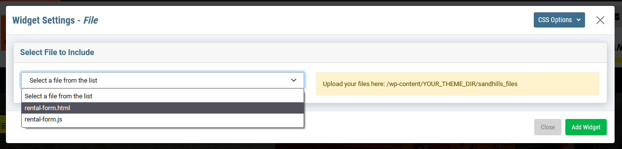
- You're done! If it doesn't show right away, it will after you save the page.
To see the weather.php file displayed at the bottom of this page, click here .
Pop-Up Widget
The pop-up widget creates a simple pop-up window on a specific page that can be edited with the full range of editor features. You can set up different editable areas, just like any content area. You can add or edit content as you normally would, it just displays in a pop-up.
- This pop-up will only display on the page you add it to. It is not a site-wide notification. (See Notification Center for that.)
- Once you dismiss the pop-up, it will go away until the session is refreshed.
To add a pop-up to the page, click ADD A WIDGET like normal and select POP-UP from the CONTENT tab.
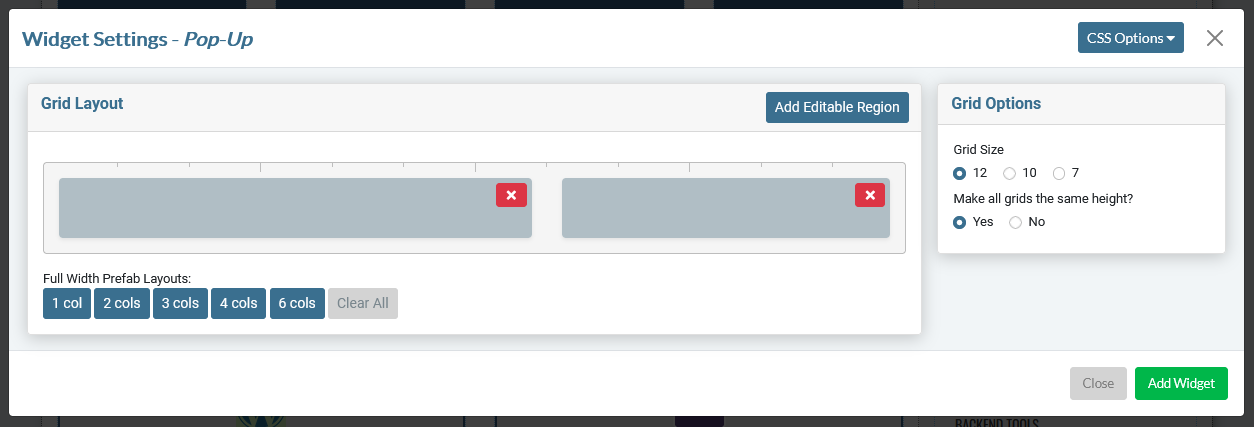
The settings pane is basically identical the the EDITABLE AREA widget, so it should look familiar. Set up your editable regions and your grid and click ADD WIDGET. In this example I have added 2 editable regions to the pop-up.
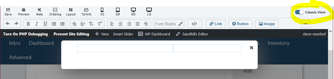
When the settings modal goes away, you should see a blank pop-up with your editable areas set up waiting for content.
IMPORTANT TIP: You will have to change the editor to CLASSIC VIEW in order to access the editor tools. There are technical reasons for this, but the short version is that it is because the pop-up sits above the page (not on the page), the dynamic editor can't be wrapped around it. Just use CLASSIC VIEW to style your content.
Add your content as you normally would in any editable area.
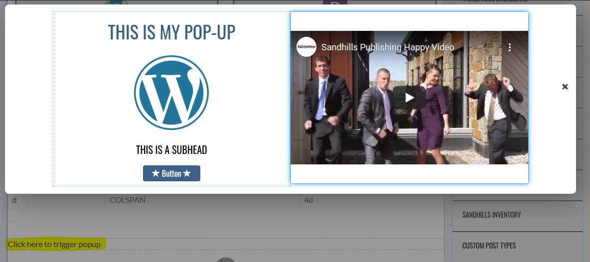
As you can see I have headings, images, a button and a video in the pop-up and it works fine.
Also notice the text in the document " Click here to trigger popup. " This is how you can manually trigger the pop-up to make edits. It displays in-line wherever you added the widget, but will be hidden and collapse completely when you are logged out.
Shortcode Widget
This widget is adds tons of flexibility because it allows us a way to add 3rd party content from plugins to the site. Most WordPress plugins are managed on the back of the site and use a special short code to tell WordPress itself where to place the output of the plugin.
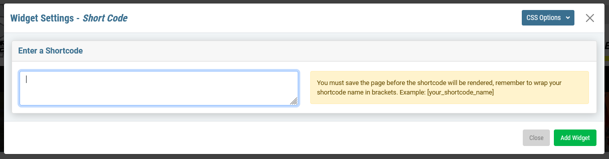
Our widget is extremely simple. Just add the widget to the page, paste the shortcode from the plugin in the box on the pop-up, and save the page. When the page reloads, it will pull whatever the output from that 3rd party plugin is and render it on the page where you placed the widget.
You can also manually set up your own files to use shortcodes to add them to WordPress, though you'll need to know some code. Click here to learn more.
Vertical Spacer
This widget is an easy way to give your widgets some visual breathing room. All it does is add blank, transparent space between the widgets or sections above and below it. The beauty of using this widget is that you can specify different amounts of space for the three main screen sizes (desktop, tablets, & mobile).
To add a Vertical Spacer widget, click ADD WIDGET then choose VERTICAL SPACER from the CONTENT pane.
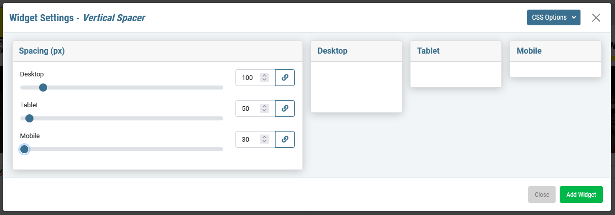
Be default, all 3 views will be set to 30px, which is the minimum height for this tool. Move the sliders to change the amount of vertical space added by the widget for each screen size. You can also type the number into the box.
The Link button will change all 3 sliders to the same setting as set in the line you clicked on, but will not prevent you from changing any of the values after clicking the button.
Remember that you have the CSS OPTIONS tab at the top if you'd like to style the area with background colors, images or anything else. Just set up your classes in the style sheet and call them here.
Form Widgets
Form Widgets hold our contact form widgets and variations thereof.
While its name is contact form, you can actually use this to put any type of form anywhere on the site. This form both emails the designated recipients and saves the submissions as a post in the database. Form widgets can be added to sidebars to display on every page or individual pages as needed.
The Form widget is a three part widget. The first tab sets up the functional settings for this instance of the widget (title, where it sends, color of ReCaptcha, etc.). The second tab allows you to customize the form itself by changing labels and adding and removing fields. The third tab lets you arrange the questions on the screen how you would like based on the 12 column grid.
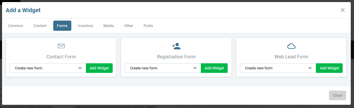
There are currently three different types of form widgets, but they are very similar in function.
- The CONTACT FORM widget is the general workhorse you will use 99% of the time.
- The REGISTRATION FORM widget is specialized version of this widget that has Currency Pay integration built in. It is specifically built to allow people to register and pay for conferences and other events. We will not go into detail on this one as it is a special use case, but it you understand the contact form, this should feel familiar.
- The WEB LEAD FORM is the same as the contact form, but we submit the information to the cloud and save it in the customer's Leads section. This does have to be configured in the cloud, so it doesn't work automatically. New sites, including all templated sites should automatically be set up that way. We will be actively moving all forms toward this.
Adding a Contact Form
The contact form is divided into steps or tabs.- The first lets you set up the individual settings for a form, such as it's title, where it's emailed to, etc.
- The Second is where you will create the form fields. This is the bulk of the work.
- The Third allows you to rearrange and format the form based on the Bootstrap grid system.
FORM SETTINGS TAB

The Form Settings pane is where you set up the behind the scenes functionality of the form.
- The title / heading that displays at the top of the form
- The subject line of the email that is sent to the clients
- The Submission Response Text is displayed to the user after they submit the form to let them know it worked.
- The Recipients(s) are the email addresses the form sends to by default (To, CC, BCC)
- The Contact Post Password is the password people use to see the contact form submission posts in the back end of WordPress (default is “sandhills”). Customers will still receive emails of the contact submissions. However, we also automatically save all contact submissions as posts in the WordPress backend. That way if a client ever deletes one or has issues with email, they can still access their contact form submissions.
The Password you set is necessary to retrieve the encrypted posts and view them in WordPress. The default password is set to “sandhills.” We recommend leaving it as the default unless the client specifically requests it be changed.
A password is not required for the email(s) that are sent to the client.
- The Redirect Page Link is for when you want a Thank You page or you want the customer to have access to download files or see unique content. Just paste the URL of the landing page in the box and the customer will redirect after submission instead of getting the Submission Response Text .
- Open in a New Tab? will pop the Redirect Page Link to a new tab after submission.
- Hide Form After Submission? will make the form go away after a successful submission to let the user know that their form submitted and they don't need to do it again. If they refresh the page, it will come back.
- reCaptcha is now optional on forms (though highly recommended). Add reCaptcha is what turns it off or on. we very highly recommend leaving it on unless the customer is insistent. People often think they don't like reCaptcha until their SPAM emails start growing exponentially. Then they start to love it.
- The ReCaptcha color behind the icons (default is blue)
- The ReCaptcha failure message if the user does not pass the reCaptcha (usually because they missed it), this error message will display.
- The Input Styles pane lets you add basic styling to the form without messing with code or CSS.
- Border Color is the color of the input boxes on the form
- Focused Border Color can change the border color when a user clicks on the box to show it is active.
- Border Radius is how rounded the corners of your input boxes are.
- Border Width is how thick the borders are.
- Space Between Inputs is the amount of padding between elements on the form.
Form FIELDS TAB
This is where we set up the form itself. On this screen, you will set up the questions you want to ask, set the correct field type for the response, and determine if it's a required field or not. Here you are setting up the nuts and bolts of the form itself. In the next step, you will arrange the questions of the form to look the way you would like. 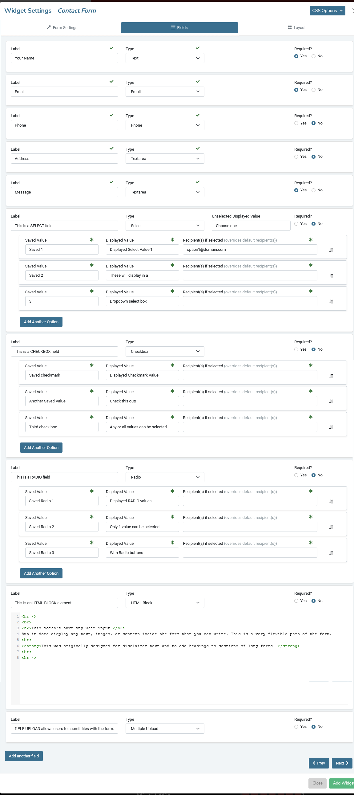
The default form defaults to having NAME, EMAIL, PHONE, ADDRESS, and MESSAGE, but those can easily be changed. You can change the label (The question you are asking users), the form field type (Text, Email, Phone Text Area, Checkbox, Radio Button, Select Box, HTML area, or file upload box) and whether that field is required or not.
Removing Items
If you don’t need a field, just blank out the label and it will disappear from the front of the form when it is saved.
Label
This is the label that displays above the input field. It is basically the question you are asking users. There are no requirements on the label.
Type
This chooses the type of input field displayed and the kind of validation for required questions.
- Text field (single line of any text)
- TextArea field (multiple lines of any text)
- Email field (validates an “@” symbol and “.com/.net/.etc”)
- Phone field (numbers only)
- Checkbox (see below)
- Radio Button (see below)
- Dropdown Selection Box (see below)
- HTML Block (see below)
- Multiple Upload (adds a browse and upload button to the form)
Required
If set to “no” the form will not validate that field.
Add Another Field Button
Click this to add another question to the Form.
Adding Checkbox Questions to your Form
Adding any multiselect is a multi-part operation. The first step is to fill out the label and choose CHECKBOX from the Type list. Once you do that, you should see your option fields show up.You will see that each Option Line you create is made up of 3 parts, SAVED VALUE, DISPLAYED VALUE, & RECIPIENT (optional)
- Saved Value
This is the value that is actually saved in the database, emailed to the client, and saved in the Contact Submission Post in the backend of WordPress. This does not have to match the Displayed Value, but it usually will. Both Saved Value and Displayed Value are required.
- Displayed Value
This is the value that is actually displayed to the customer on the front end of the site. This does not have to match the Saved Value, but it usually will. Both Saved Value and Displayed Value are required.
- Recipient(s) if selected
This is totally optional and will only be used in certain circumstances. However, it’s an incredibly useful feature for clients. This will allow you to overwrite the default recipient on the form and send the email to someone else if this value is selected. This is great for general contact forms to get directed to the correct department (sales, customer service, parts, etc.).
This field will likely be left blank on most forms, but if you do fill it out, both saved and displayed values are required as well. You may add multiple recipients by listing them in a comma separated format. (ex: email1@domain.com, email2@domain.com)
- Add Another Option Button
Clicking this button will add another row to the Options List for you to fill out. If you add a row and don’t need it, just leave it blank and the field will not display on the form.
Adding Radio Button Questions to your Form
Adding any multiselect is a multi-part operation. The first step is to fill out the label and choose RADIO from the Type list. Once you do that, you should see your option fields show up.You will see that each Option Line you create is made up of 3 parts, SAVED VALUE, DISPLAYED VALUE, & RECIPIENT (optional)
- Saved Value
This is the value that is actually saved in the database, emailed to the client, and saved in the Contact Submission Post in the backend of WordPress. This does not have to match the Displayed Value, but it usually will. Both Saved Value and Displayed Value are required.
- Displayed Value
This is the value that is actually displayed to the customer on the front end of the site. This does not have to match the Saved Value, but it usually will. Both Saved Value and Displayed Value are required.
- Recipient(s) if selected
This is totally optional and will only be used in certain circumstances. However, it’s an incredibly useful feature for clients. This will allow you to overwrite the default recipient on the form and send the email to someone else if this value is selected. This is great for general contact forms to get directed to the correct department (sales, customer service, parts, etc.).
This field will likely be left blank on most forms, but if you do fill it out, both saved and displayed values are required as well. You may add multiple recipients by listing them in a comma separated format. (ex: email1@domain.com, email2@domain.com)
- Add Another Option Button
Clicking this button will add another row to the Options List for you to fill out. If you add a row and don’t need it, just leave it blank and the field will not display on the form.
Adding a Dropdown Selection Field Questions to your Form
Adding any multiselect is a multi-part operation. The first step is to fill out the label and choose SELECT from the Type list. Once you do that, you should see your option fields show up.You will see that each Option Line you create is made up of 3 parts, SAVED VALUE, DISPLAYED VALUE, & RECIPIENT (optional)
- Saved Value
This is the value that is actually saved in the database, emailed to the client, and saved in the Contact Submission Post in the backend of WordPress. This does not have to match the Displayed Value, but it usually will. Both Saved Value and Displayed Value are required.
- Displayed Value
This is the value that is actually displayed to the customer on the front end of the site. This does not have to match the Saved Value, but it usually will. Both Saved Value and Displayed Value are required.
- Recipient(s) if selected
This is totally optional and will only be used in certain circumstances. However, it’s an incredibly useful feature for clients. This will allow you to overwrite the default recipient on the form and send the email to someone else if this value is selected. This is great for general contact forms to get directed to the correct department (sales, customer service, parts, etc.).
This field will likely be left blank on most forms, but if you do fill it out, both saved and displayed values are required as well. You may add multiple recipients by listing them in a comma separated format. (ex: email1@domain.com, email2@domain.com)
- Add Another Option Button
Clicking this button will add another row to the Options List for you to fill out. If you add a row and don’t need it, just leave it blank and the field will not display on the form.
Adding HTML elements to your form
This gives you the ability to insert an HTML element inline anywhere in your form. It is self contained and will not wrap around other questions or elements of the form.However, it does give you the options to insert headings, styled content, disclaimers, images, horizontal rules, etc. Basically, anything you can code in HTML can now be displayed inside your form.
When you select HTML Block from the Type menu, a blank code mirror area is opened and you can start adding in your HTML.
It will render your code wherever this field is positioned in the form. You can move it around inside the document in the layout step just like any other field.
Multiple Upload
This is a simple browse and upload box. The tool does allow multiple files to be uploaded for a single contact form submission. This is especially useful for things like job applications where customers may want to upload multiple files, like a resume, cover letter, and CV.Files uploaded are emailed directly to customers and not saved on the servers themselves. This is for security and to reduce overhead on the servers. It also means that if an email is not delivered to the client, we will still have the saved form data, but won't have the files that went with it.
There is an 8MB max file size. This is to ensure that the emails aren't blocked by the size limits normally imposed by our customers' different email providers. However, the limit is 8MB per file, so it's possible that the emails could still get caught in the customer's email filters and blocked if multiple large files are uploaded at once. This would be a very rare scenario, but we can adjust this on a site by site basis if it becomes a problem.
These are the allowed file types:
- Almost any word processing document
- ZIP
- JPEG
- PNG
- GIF
LAYOUT TAB
The Layout Tab allows you to rearrange and layout the form questions to better fit the page you are designing. The tab starts out with each question represented as a box that spans a full 12 column row.
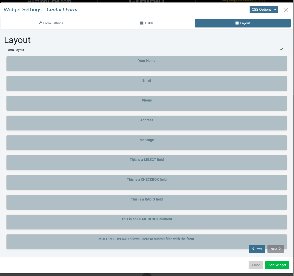
You may resize the question area and drag them around the page as you see fit. You can leave blank spaces in the structure to create whitespace.
The questions are responsive and will wrap to their container. Keep in mind when laying out your page that this only represents the width, not the height of each element. Below is an example of the same form as above, just restructured to a new layout.
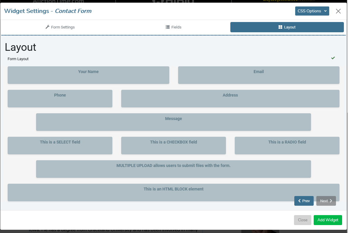
You can see that I have not only changed the width of the elements, but also changed the order that some fields will display on the page. Below is the actual form as it is rendered on the page (with default styling).
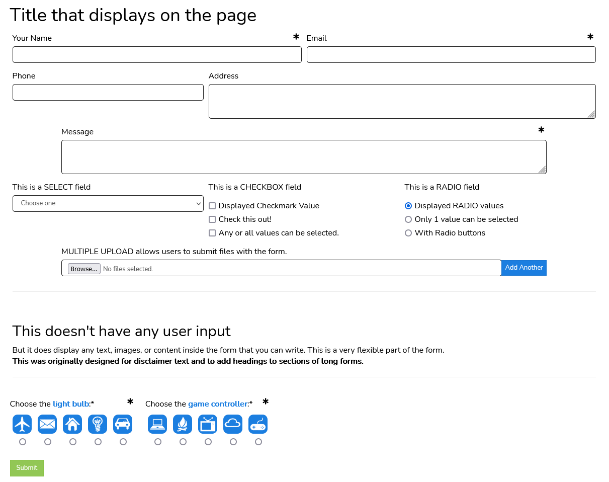
When a user fills out the form and clicks submit, the form will disappear and display a thank-you message. This is editable in the first tab in the Submission Response Text field.

Media Widgets
Media widgets house all our slideshows, galleries, and any other image-based widgets.
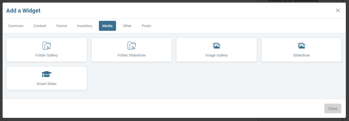
The difference between FOLDER GALLERY/SLIDESHOW and the IMAGE GALLERY/SLIDESHOW is in how you select the images that display in the gallery/slideshow.
In a FOLDER Gallery/Slideshow , you set up your folders in the MEDIA > FOLDER VIEW page of the WordPress Dashboard. Any image in that folder is automatically added to the gallery or slideshow. This means customers don't have to go in and edit the widget on the page to update it's content, just change the images in the correct folder.
In a IMAGE Gallery/Slideshow , you select individual photos you want from the standard WordPress mashup of all images ordered by most recently added first. To update the slideshow, you must edit the widget.
The Folder Gallery is an easy way to have an image gallery on a website. Customers can easily add and remove photos fro the FOLDER VIEW page of the Dashboard and the gallery automatically updates as the pictures in the folder change.
As with any gallery, if you click the image it will open full-size in a lightbox and show titles and captions.
To add a gallery to a site, click the ADD A WIDGET button and choose the FOLDER GALLERY from the MEDIA tab.
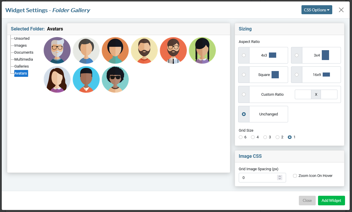
- Selected Folder
Choose the Folder from the file tree on the left (in this case, Avatars). You will see a preview of the images on the right. You do not have to select images as all images in the folder will be added to the gallery. You will manage the images in the gallery by managing the images in the folder. You will generally want a folder for every different gallery.
- Aspect Ratio
This is the individual shape of each of the containers the images are bound in.
- 4x3, 3x4, Square, 16:9: These are fairly normal aspect ratios for images. Choose the dimension that best fits your design or your images.
- Custom Ratio: Use this to create a photo grid that conforms to your own aspect ratio that best fits your particular images
- Unchanged: This will equally space the images and center them as best as it can in each row. Each image will be fully visible. You get some weird alignment and spacing if you have widely varying images sizes though.
- Grid Size
Number of images per row on the page. The gallery will wrap images automatically.
- Grid Image Spacing
The total amount of whitespace between images. The tool cuts the number you enter in half and applies that amount of space to all four sides of the image to create even spacing.
- Zoom Icon on Hover
This will add a dark overlay and add an icon of a magnifying glass when the image is moused over. This prompts users to click on it to see the full-size image.
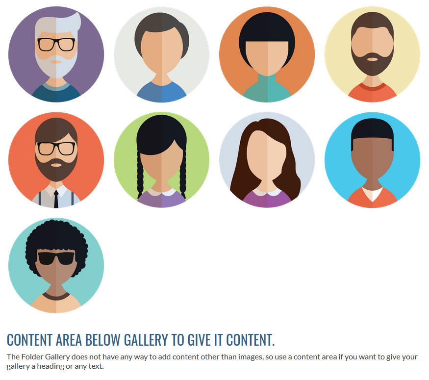
Below is the grid of the images from the settings above. I have given the images an Aspect Ratio of square, a Grid Size of 4, and Grid Image Spacing of 15px. We have 15px of spacing between images, but the space on the left and right is half that to make the images look properly centered on the page.
Folder Slideshow
The Folder Slideshow is similar to the Folder Gallery, but there are a few differences. This is really designed for simple slideshows, or slideshows where the customer will need to edit them regularly. For more advanced features, we recommend using Smart Slider .
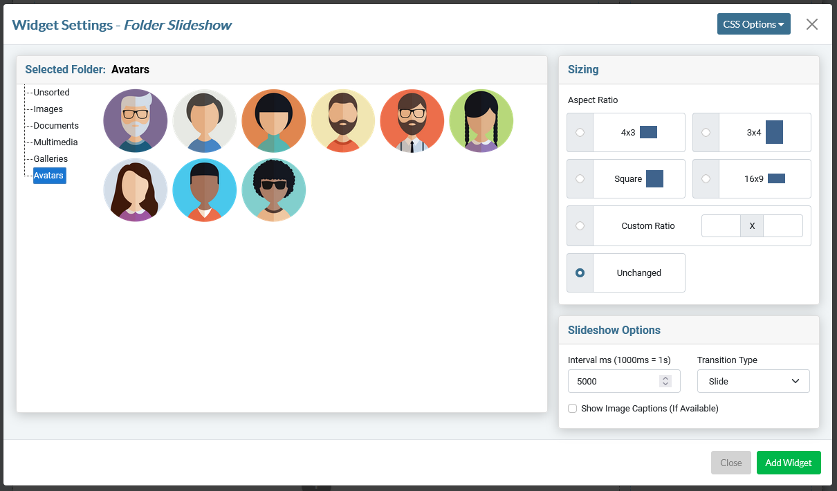
- Selected Folder
Choose the Folder from the file tree on the left (in this case, Avatars). You will see a preview of the images on the right. You do not have to select images as all images in the folder will be added to the slideshow. You will manage the images in the slideshow by managing the images in the folder. You will generally want a folder for every different slideshow.
- Sizing
This is the individual shape of each of the containers the images are bound in.
- 4x3, 3x4, Square, 16:9: These are fairly normal aspect ratios for images. Choose the dimension that best fits your design or your images.
- Custom Ratio: Use this to create a photo grid that conforms to your own aspect ratio that best fits your particular images.
- Unchanged: This will equally space the images and center them as best as it can in each row. Each image will be fully visible. You get some weird alignment and spacing if you have widely varying images sizes though.
- Interval
The Slide Interval is how long each slide is presented before the next one comes in. It is set in milliseconds (1000 milliseconds = 1 second). So if you want something on the screen for 3.5 seconds, you would set this to 3500. The default value is 5000, or 5 seconds.
- Transition Type
This just sets the type of animation between slides.
- No Transition: No transition, the slides just instantly replace each other
- Slide Transition: The next slide flies in from the right to push the old one out.
- Fade Transition: The new slide fades in to replace the old slide.
- SET IMAGE POSITION
This just sets the position of the image anchor. You can choose TOP, BOTTOM, or CENTER. This is important as we set the width to 100% and anything that falls outside the defined box parameter will be cropped off. Center is likely the one you would choose most often, but it depends on where the focal point for your images are.
- Title Display
Chooses whether you want to display the image's TITLE. This can be set in the MEDIA page of the Dashboard. Caption Display Chooses whether you want to display the image's CAPTION. This can be set in the MEDIA page of the Dashboard.
Below is the slideshow from the settings above used in conjuction with text. It's an unusual way to use a slideshow, but works best for the aspect ratio of the images in the folder.
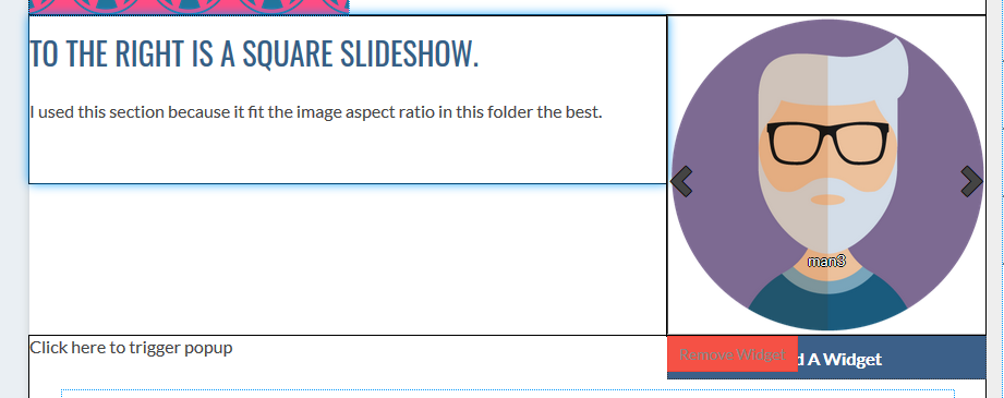
Image Gallery
The image gallery will create a dynamic grid of images on a page. You can use this to create any grid of any photos you choose.
The biggest difference between this and the FOLDER GALLERY is that here you choose individual photos from the entire group of WordPress Media. With the Folder Gallery, you manage the photos in the slideshow by moving the images in and out of the folder they live in. So, this is a better choice if the customer doesn't have to manage the images in the gallery. If the customer needs to change out photos, the folder gallery is generally a better choice.
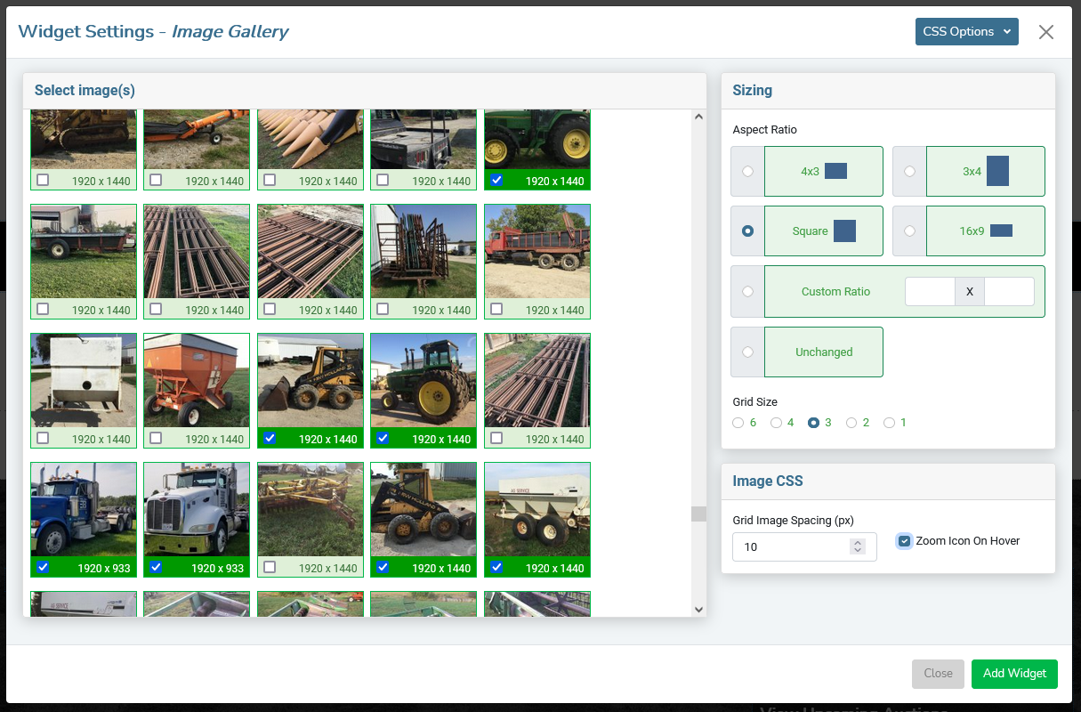
WordPress by default does not have a way to organize photos. They’re all just held into one big bucket. This makes it very easy to use photos across the site in multiple ways, but there’s no way to have predefined groups of photos. At least not natively. Without predefined groups, we have to sort through all the images and individually select the ones you need for this page’s Image Gallery.
Please be aware that the Image Gallery widget does not have an upload feature . You must upload the images to the site before you add the widget. You may do this either with the MEDIA tab in the Sandhills CMS or by clicking the MEDIA tab in the backend of WordPress. See the MEDIA section for more instructions.
- To select your photos for the gallery , just click on each image to select it. You will see a green border and background around it as well as a checkmark in the box to designate that it is selected. Click it again to deselect it.
- The aspect ratio is the last thing you will need to select. There are several sizes predefined that you can choose from. If you select one, it will scale the image to fit nicely in that proportion. It does this by setting the image as a background image then adding a clear .PNG of the correct proportion as the foreground image. This image will stretch to fit its container and display as much of the background image as possible. When a user clicks one of the images in the grid, it will display in a light box and show the full image as large as possible.
If you don’t like the standard sizes here, you may select Unchanged which will not crop the images. Be aware that the images will NOT have standard sizing unless all your image are identically sized and this may create irregular spacing.
You may also designate your own ratio that better fits the page or your images. It will work identically to the pre-defined images, but will use the ratio you select.
- Select your Grid size (6,4,3,2, or 1 image across). In this case I have 7 images selected and a grid of 3. So it will do two rows of 3 images and then wrap to a new line with the last image.
- Add Image Spacing between the images in the grid if you want. The setting is in px.
- Zoom Icon on Hover will add a dark overlay to the image and adds a magnifying glass icon when moused over to encourage users to click on the image. Either way, when the image is clicked the image lightboxes out.
- Once you have all the images and options selected, just click the “Add Widget” button and your Gallery is added to the page. It will scale to fit the Section it is in using the selected grid.
Slideshow
The set-up window is virtually identical to the image gallery widget above, but the photos you select will populate a scrolling slideshow instead of a grid of photos.
The big thing here is selecting the correct aspect ratio. The photos will scale to fit the container (usually width), then crop the overlapping image off.
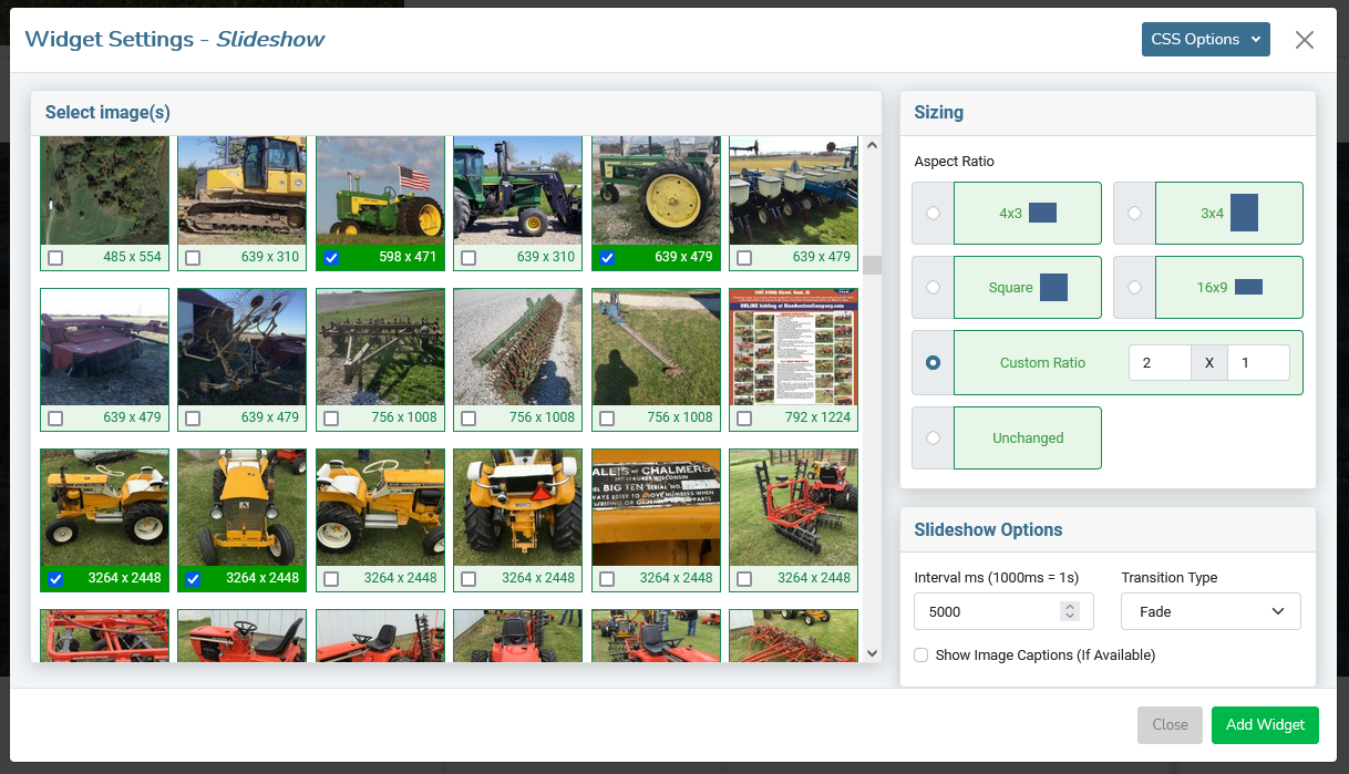
- Select the images you want to use. You'll see the check mark and the background will turn green.
- Choose your ASPECT RATIO .
- Predefined aspect ratios will crop the image to fit.
- Custom ratio allows you to choose your own ratio to fit your design.
- Unchanged will use the image's ratios, but the page could jump if the images are different ratios.
- Set up your Slideshow Options . You can set how fast the slides move and whether they fade in or slide it.
- Show Image Captions will display any captions added to the individual images from the back-end MEDIA page in the WordPress Admin section.
- Click ADD WIDGET to add it to the page.
Smart Slider
This widget is another simple one. It just gives you a list of Smart Slider Slideshows and lets you choose one to add to a page. This is mainly just to make our customers' lives easier by not having to open the slider and find the shortcode.
To add a Smart Slider widget, just click the ADD A WIDGET button and choose SMART SLIDER from the MEDIA tab.
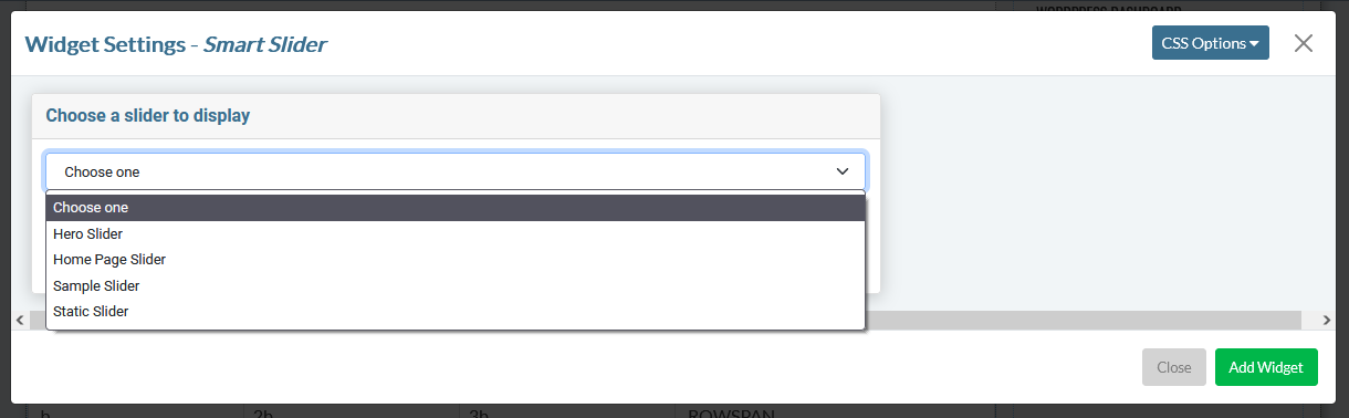
Just choose the correct slideshow from the list in the Widget Settings window and click ADD WIDGET.
The first time you add a Smart Slider to the page, it most likely will not load after you insert it. You will just see the shortcode for the slider. Please save the page and you will see it render in the correct location.
Post Widgets
Posts Widgets are anything that uses serialized content to output a group of pages or elements. Anything that WordPress would consider a Post. This includes Custom Post Types, Blog Posts, etc.
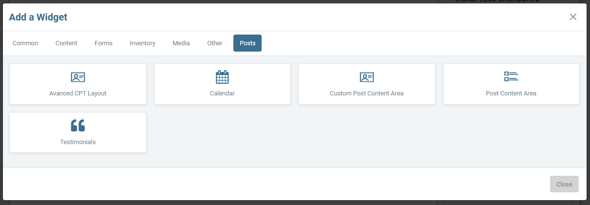
Advanced CPT Layout
The Advanced CPT Layout widget is designed to let you set up completely customized repeating elements using your CPT data to output through a widget. You will choose the CPT you want to use and set up the parameters of how you want the repeating elements to display on the page in the settings on the left.
You will then set up the HTML for each element on the right using variables to insert the unique post data into the layout in the correct places. It sounds crazier than it is.
STEP 1: Fill out the settings
Below is an empty Advanced CPT Layout Settings modal.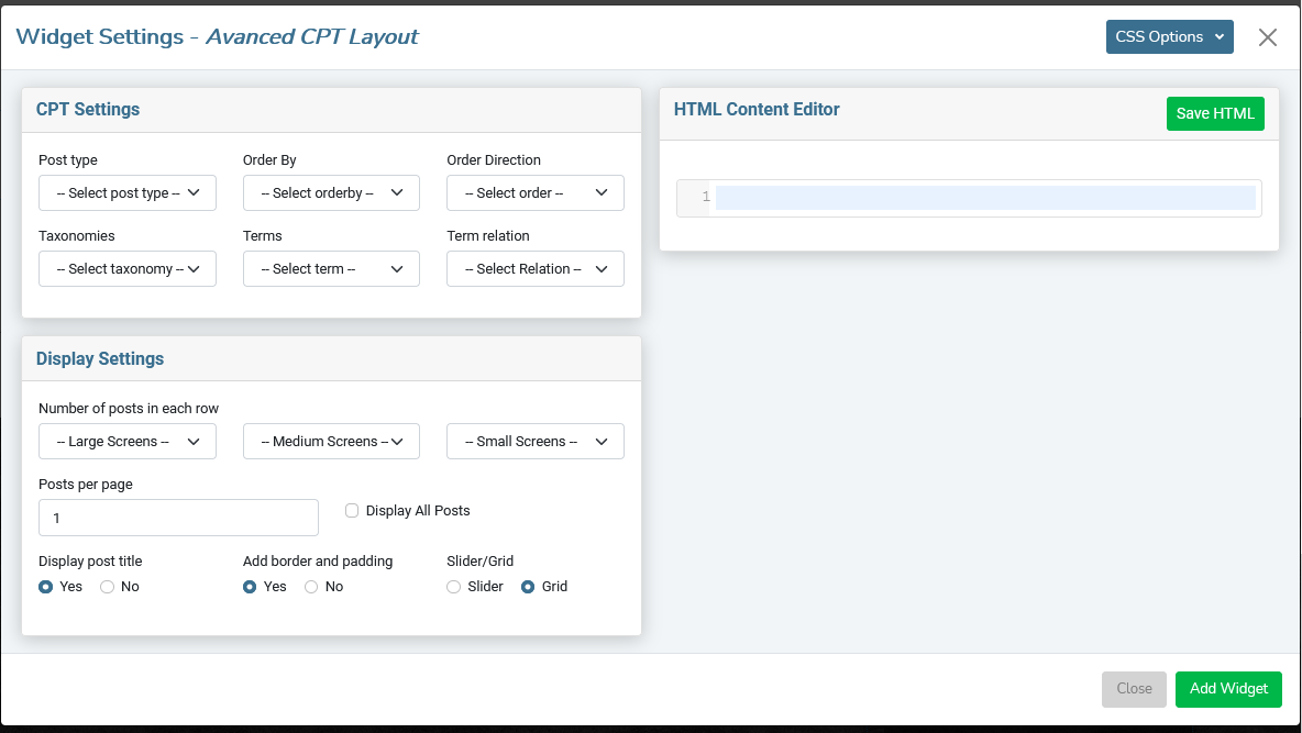
CPT SETTINGS PANE
- Post Type
Choose the Post Type you would like to work with from the dropbox.
- Order By
Choose which field your post are ordered by using this setting.
- Order Direction
Choose which way your post order from here (descending / ascending )
- Taxonomies
If your CPT uses Taxonomies (categories), you can use this (or not) to filter your listings.
- Terms
If you are using Terms (individual tags within a Taxonomy) to tag the posts, you can choose those here to filter content. You can choose multiple Terms to filter by.
- Term Relation
If you filter using multiple Terms, you can select AND so that both Terms must be tagged to the post for it to display, or you can choose OR to display any posts that are tagged with either Term independently.
- Number of post in each row
In the next group of dropboxes, choose the number of posts you would like to display in each row. You can choose up to 4 posts per row. There is a dropdown for each screen size (large, medium, and small screens) extra small screens will default to 1 post per row.
Display Settings Pane
- Number of posts on each page
This is the total number of posts to display on the page. Use this in conjunction with the Number of posts in a row field to control the maximum number of rows you want displayed on the page. For example, if you want 3 rows of 4 posts for your design, you would set the Number of posts on each page to 12.
- Display all posts
If you always want all posts to display, check the box.
- Display Post Title
Display the post title or not.
- Add border and padding
Choose to add predefined border and padding styles here. This adds additional classes to give the posts a card layout look. You can overwrite these styles to customize the look in style.css.
- Slider/Grid
Choose whether your posts layout in a slider (one row of items, displaying in a slideshow) or a grid (rows of items all laid out in a grid).
STEP 2: Write the html output structure
You will write the HTML for the output right in the widget itself in the HMTL CONTENT EDITOR .
You will write the output for a single "card" in the HTML CONTENT EDITOR using the PHP variables provided in the Field Identifiers to place individual post data in the correct place in your HTML structure. If you're familiar with CPTs, you are just writing the HTML output for the archive view.
Understanding Field Identifiers
Field identifiers are a little confusing at first glance, especially if you aren't familiar with PHP variables. However, it's pretty simple to decode.The Field Identifiers structure:
CPT Field Name: $Variable (Description of data)
- The Bold Underlined Section: is the field name in the CPT. You don't need this, other than to understand which field you are calling.
- The Bold Variable starting with a $ is the variable itself. Insert this anywhere you want to output the data from that field in the CPT. Just structure your HTML like a static element, but use the variables in place of the content.
- At the rear is the (field type in parenthesis). This helps you understand the type of data that will be output on the page so you can use the correct variables in the correct place.
For example, get_permalink(); calls the post's detail page. You probably wouldn't use that as text on a page, but they are fantastic inside a link, for example: click here . The link will universally display " click here " on each item, but each link will direct to the correct CPT detail page.
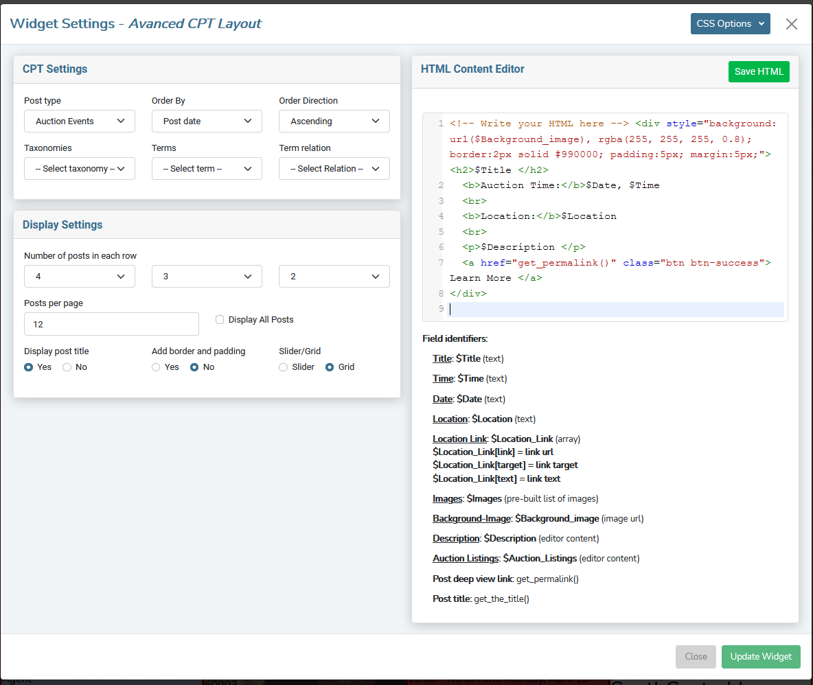
Here is a settings modal that I have filled out and written the basic HTML for. The Field Identifiers that give you your dynamic variables will show up as soon as you choose the POST TYPE in the CPT SETTINGS pane. Each post type is different, so it cannot give you output examples until the Post Type is specified.
Please Note:
The two green buttons on the page are very important and you need both of them. You MUST save your HTML before you can update the widget, otherwise your changes be lost. In the image above, you'll see that the SAVE HTML button is active and the UPDATE WIDGET button is inactive. If you've even clicked into the HTML CONTENT EDITOR, you won't be able to click UPDATE WIDGET until you click the SAVE HTML and write your changes to the database. It's an easy thing to overlook.STEP 3: review and modify
If you are like me, it's never 100% right the first time. The good news is that editing a widget is identical to set up. Like many widgets, you will have to save any changes to the widget before you can re-edit the settings. You can also refresh the page to revert any changes and start over.Below is a screenshot of the above code using real customer data. If this were more than an example, I would have added more classes and style to make it more uniform and professional. This is just to show you how quickly you can build simple repeating elements using this tool.
And the best part is that your customers can easily add and remove these elements themselves through the back-end CPT forms!
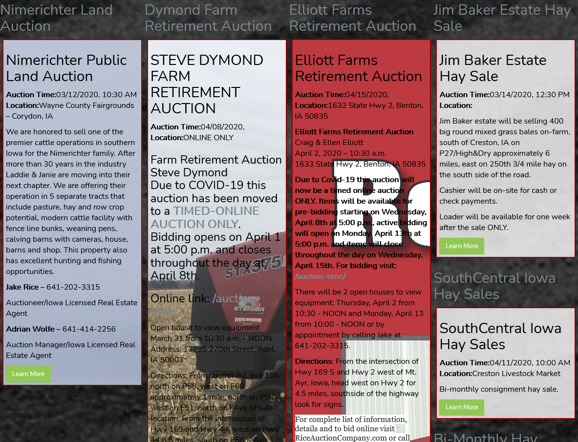
One thing to note above is that I have the title turned on in the Settings, and I also call it in the HTML, so it outputs twice. Once above the element (from the settings) and once inside the element (from the HTML). Be aware that if you have the title on in the settings, it will appear above the HTML element you are creating, not as a part of it.
Custom Post Content Area
The Custom Post Content Area allows you to add CPT data anywhere you can add a widget.
This is an extremely similar widget as the ADVANCED CPT LAYOUT widget above. The big difference is that this is quicker and easier because the HTML structure is already set up. Each element is classed, so you can easily style the widget to fit the look and feel of your site by overriding the classes in style.css .
STEP 1: add the widget to your page
Just click the ADD A WIDGET button and choose the CUSTOM POST CONTENT AREA from the POSTS tab.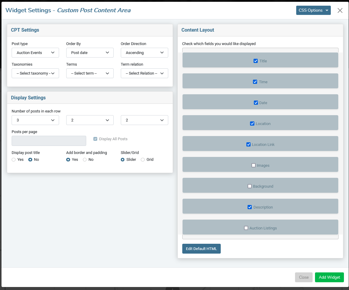
This tool is super simple to use.
- Select the CPT you want to add to the page using the POST TYPE field.
- Configure your settings.
- Activate the fields you would like to display by checking the box in the CONTENT LAYOUT pane.
- Resize and rearrange the fields as needed by dragging them up and down in the CONTENT LAYOUT pane.
- Click ADD WIDGET to add your CPT content to the page!
If you'd like to add more style or configure the elements in a different way, you can access the HTML output of each element by clicking the EDIT DEFAULT HTML button below the Content Layout pane.
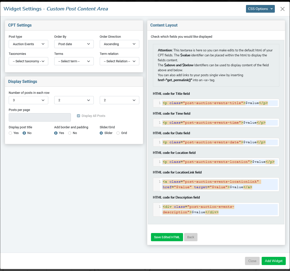
To edit the HTML of the individual items:
- Click the EDIT DEFAULT HTML button below the Content Layout window.
- Make your modifications to the fields you would like to (add classes, change structure, etc.) and click the SAVE EDITED HTML button at the bottom to lock in your changes.
- Click ADD WIDGET to add the CPT Content to the page.
POST CONTENT AREA
This is basically for blog-type posts. The idea is similar to the CPT Widget above, but for generic WordPress posts. Posts don't have many custom fields, so the output is pretty standard for blogs.
This was specifically developed as a way to make NEWS or BLOG listings available inside the editor for customers who are familiar with WordPress and want to use the standard editor for their blog. This will create a series of archive views on the page.
There are no special tools to add posts, as this uses default WordPress posts. Please note that this will not display PAGES, which is what we create with the editor, just standard WordPress posts.
add the POST CONTENT widget to your page
Just click the ADD A WIDGET button and choose the POST CONTENT AREA from the POSTS tab.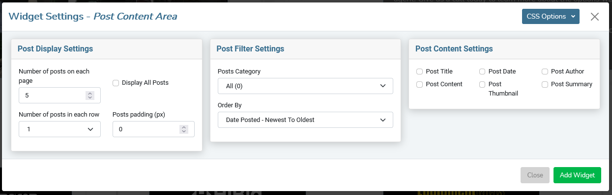
These post output will pretty much be set up by the files in your Theme. All we are doing is controlling the number of listings and which of the standard data that you want to show on the page.
Post Display Settings Pane
- Number of Posts on each page
This is the total number of posts. Use this in conjunction with the next field (Number of posts in a row) to determine how big you want this section to be.
- Display All Posts
If you would like to show ALL posts, check the box.
- Number of posts in each row
This is where you set your grid. You can choose up to 4 posts per row.
- Posts Padding (px)
Adds a little space around your posts.
Post Filter Settings Pane
- Post Category Filters output to specific categories.
- Order By Choose the field and the sort direction.
Post Content Settings Pane
Click the box next to each piece of data you want displayed on each listing. The items in the list are based on standard WordPress post fields. Put a check in the box next to any data you would like to output to the page.Each content type will automatically be classed so you can override their default styling in the style.css file.
Calendar
The Calendar is a two-part system. It starts with a Custom Post Type that customers will use to enter events into the calendar and are displayed on the front of the site in the Calendar widget. This was designed mainly for auction customers, but can be used for any events your customer may have.
STEP 1: Create Calendar CPT
Go to SETTINGS > CUSTOM POST TYPES and add the CALENDAR Prefab CPT. Instructions to create and modify the CPT are here .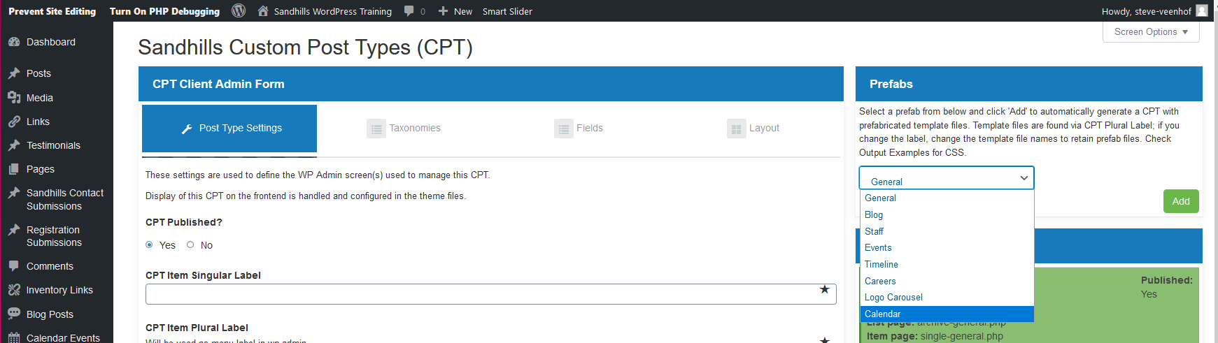
STEP 2: Create some Calendar Events
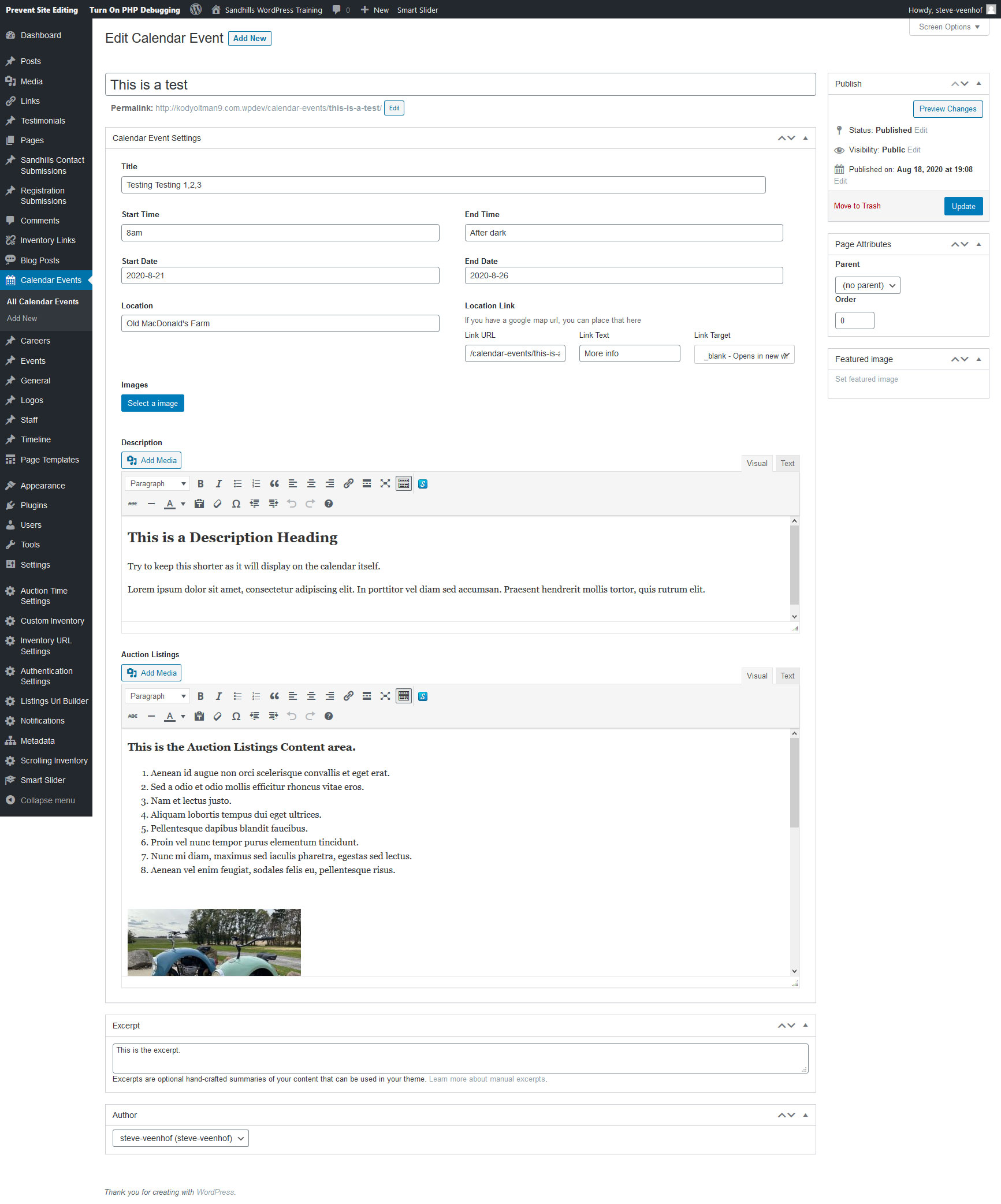
Above is the default fields available in the Calendar CPT. You can certainly alter the CPT to make sure all the fields you need are included. Just make sure to leave the date picker fields or it won't show in the calendar.
Step 3: Add Widget to Page
Just click the ADD A WIDGET button and choose the CALENDAR from the POSTS tab.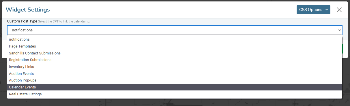
The settings are pretty simple. If you have multiple Calendar CPTs, you may choose which CPT gets displayed in this calendar by selecting it from the drop-down list. Click ADD WIDGET to add the calendar to the page.
Please NOTE:
The page will will likely look like the calendar didn't get added after you click ADD WIDGET. Save the page and the Calendar will render in the proper place.Below is what the default Calendar will looks like
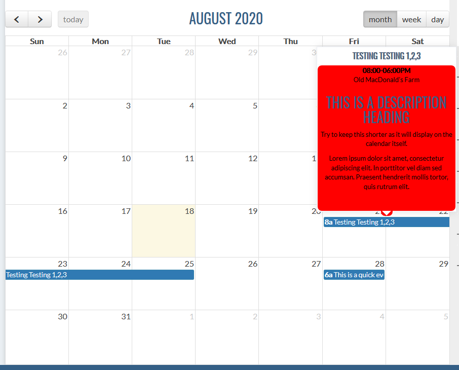
Now that you've seen the whole process, there are a few things to note:
- You will obviously want to style the pop-up to match your site.
- The DESCRIPTION box shows up in the mouse-over bubble, so keep it somewhat short.
- The AUCTION LISTINGS only show up in the event's SINGLE page (details).
- The LINK you set up will be activated when you click on the blue bar in the calendar. If you want it to go to the event detail page (or single view for the CPT), you'll need to give it the relative link from the SLUG .
EXAMPLE : /calendar-events/name-of-event .
- The START TIME & END TIME are just text fields that can be anything. The calendar only cares about dates.
Testimonials Widget
This widget is technically just a specialized Custom Post Type. It requires both back-end and front-end editing. You enter the actual testimonials in the backend of WordPress like a traditional WordPress plugin, but you add the testimonials to the front end of the site by adding a widget.
Testimonials Backend
To add a testimonial, go to the dashboard and click the testimonials tab on the left. There will be a list of all testimonials added to the site, as well as a button to add new testimonials. Click Add New.Fill out the information on the form to match your design. If no content is filled out, the field will not be displayed on the front end. All options can by rearranged or prevented from outputting in testimonials.php and styled in testimonials.css. More info on that below.
- Enter Title Here
This is the title that appears on the top line of the testimonial below the stars by default.
- Content area
This is the bulk of the testimonial itself. The style applied by the editor does show up in the output.
- Name
This is the name of the reviewer and comes next. By default it’s big and bold by default.
- Title
Comes under the name, italicized by default.
- Relationship
Comes under the title, italicized by default.
- Rating
This is a 5 star system. The number you give it is the number of stars it outputs. (The higher the better). This actually displays above all text on the testimonial by default.
- Image
Browse and upload an image. It will display at the top of the testimonial by default.
- Website
Adding this will link the whole testimonial to a specified URL. Be sure to include the http:// if it goes outside the current site.
Testimonials Widget
Super basic widget. It just inserts the placeholder that renders the testimonials.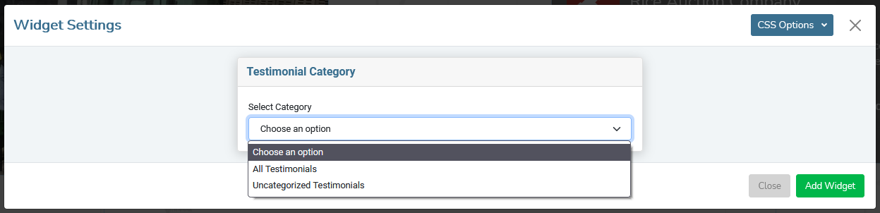
Choose which category you would like to display on the page. The above example did not have any categories set up, so we just have the two default values: All Testimonials and Uncategorized Testimonials. Click the Add Widget button. Done!
Be aware that if there are no testimonials saved in the back-end, it will NOT look like the widget is working. It is. It just has no content, and so it is completely collapsed. It’s best to add a few testimonials in the back-end before adding a widget to the page.
Modifying Testimonials
We know that no two testimonials sections are ever designed to look the same. To that end, we have given you access to the file that builds the output in PHP and the specific CSS file for this widget.The files can be found in the WIDGETS folder inside your account folder. Both are fairly well commented so you can understand what builds what.
The testimonials.php file will allow you to cut, paste, copy and delete the individual sections of the testimonials widget so that it has the perfect amount of information, in the perfect order. You can also add or change the structure of the testimonials in the file. Feel free to update this file however you would like. Some people even add carousels to the testimonials to create moving slideshow of glowing customer reviews.
The testimonials.css file has all the classes that make up every different part of the testimonials widget. They are fairly clearly labeled, but if you have questions, just inspect the output in your browser and you should be able to figure out which classes affect each section of content.
Other Widgets
This is the catch-all for specialized widgets or things that just won't get used much. There's nothing wrong with these widgets, we just keep them out of the customer's way as they won't apply to 95% of our customers.
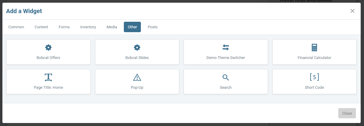
Bobcat Offers
This is the Special Offers page specifically for Bobcat sites. It pulls offers from a central location that is updated monthly based on new offers from Bobcat.Example: https://www.sandhillsdemo1.com/special-offers/?theme1
Bobcat Slides
This is the home page slideshow specifically for Bobcat sites. It is a Smart Slider that pulls offers from a central location that is updated monthly based on new offers from Bobcat.Example: https://www.sandhillsdemo1.com/