The Editor
Why the Sandhills CMS?
The Sandhills CMS is specifically developed to help make editing your website as easy as possible. The Sandhills CMS lets you edit content in real time right there on the live page. When you click the save button, the page should look almost identical to what you had just finished editing.What makes our editor different is the fact that it uses the exact same live data and style rendered in the same space as the finished content. When you hit the save button, you know exactly how your page will render. You don’t have to switch back and forth between the editor and the live site to see what your changes look like.
This is not only less cumbersome, but also a far more intuitive way to edit your content. In many ways, the editor resembles a simple graphical word processing software that you are likely familiar with, like MS Word. In fact, the editor is specifically designed to be used by people with no web experience. If you have any basic computer skills, you should be able to successfully edit a Sandhills WordPress website.
What Can I Edit?
In the Sandhills Editor, you have control over any region that has a blue border around it. These "widget" areas are the basis of the editor. There are lots of different widgets, but the most common are the editable area widgets. These hold the vast majority of your content and are where you will edit text, photos, and other content.

You can easily tell where widgets are. When the editor is turned on, they are surrounded by a thin blue border. When a specific editable region is selected, you will see that border become a blue drop shadow. Just click on a region to make it active.
We will get into how to add and manage widgets later. Right now, just know that you should be able to edit any content inside any section with a blue border.
A Brief Tour of the Editor
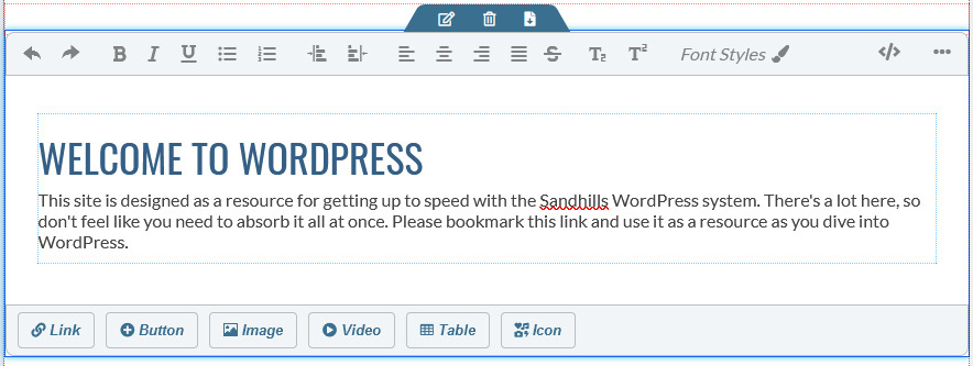
Most of the editing functions lie in toolbars. The editor is made up of two sections, and each section has two rows of controls. At the top of the site we have the General Page Controls in the light gray bar at the top and the WordPress Menu Bar in black below it.
The second section is a Dynamic Content Editor . The bar above the content area presents controls for styling text, while the bar below the content area allows you to insert new elements like photos and buttons into the content area. Both of these bars will move around the page dynamically to the active element you are working on.
General Editor Controls

Dynamic Content Editor
The WordPress Menu Bar.
The bottom row of the General Controls is almost black and is visible when in or out of editing mode. It is the standard WordPress Menu Bar, but with a few new additions. Most notably, the SANDHILLS EDITOR link toward the middle of the screen. It is the most important part of the WordPress Menu Bar as it toggles the rest of the editor on and off.

-
Prevent Site Editing / Unlock Site
This just tells you whether you can edit it or not . If it’s locked, it will tell you who has it checked out.
-
+ New
Allows you to add new WordPress pages or posts. You will almost always choose page. So much so, that if you just click +New , it will automatically start a new page for you.
-
Smart Slider
This is a quick and easy way to navigate to the Smart Slider tool in the back-end of WordPress where you can edit your slideshows and create new slides.
-
WP Dashboard
This opens up the WordPress Dashboard in a new tab. This is the easiest way to get to the standard WordPress dashboard on the back of the site.
-
Sandhills Editor
This toggles the rest of the editor off and on. When on, the light grey bar above it will be visible. You will also see light blue outlines around widgets and editable content areas. When you click into a blue bordered content area, much of the editor’s features will become active and can be used. You must click into the region you would like to edit to activate these tools. You may also add new Widgets to the page when the editor is active.
-
Your Name
This is your username. Hover over your name to get a list of account options, including logging out of your site.
General Page Controls
The top row houses general controls that are not specific to content, like SAVE (Which saves the entire page) and META (which houses the page's metadata). It also has controls to mimic different size screens and devices so you can see how your site will look on different platforms while you are still editing it. There is also a toggle for Classic View.

-
Save
Opens a pane that will allow you to change the major page settings (Published or Draft, Page Title, Metadata, Social Media tags, etc.)
-
Preview
This basically just hides the blue boxes as the editor is totally WYSIWYG.
-
Meta
This opens the Metadata panel. This is basically the same as the SAVE panel, but you don't have to save and publish your changes when using this button.
-
Ordering
When you click on this, you will no longer be able to edit content on the page. However, the widgets can now be dragged up and down and from section to section to re-order the content on the page. As you drag the widgets around the page, a blue bar will appear to let you know where that content can be dropped. Release your mouse button to place the content where this placeholder sits. Click the Ordering button again to resume editing the content as normal.
Please note that widgets cannot sit inside other widgets. They all sit on the same level inside their Section and will re-flow around each other responsively based on different screen sizes.
-
Layout
This helps you manages the Sections of your page. Remember that Sections hold Widgets, and Widgets hold content. These Sections create the page structure that the widgets live in. The layout pane allows you to easily add sections or modify their widths, thereby changing the overall page structure. We discuss this tool in detail in Adding Sections to Your Page .
-
TPL Info
This is information designed to help you set up the template easier. When clicked, it will color all the different modules and sidebars on the page and give you info on what file creates the sidebar and where they are called in the code to style or remove them.
-
Media Sizes to test responsiveness
These buttons change the width of the website to match what they would look like on different size screens and devices. This allows you to see how the web page you are building would look on a phone while you are still editing on your desktop.
-
Classic View Toggle
 Classic view takes the dynamic portion of the editor and adds it into the top edit bar. This is needed for certain widgets (like the accordion), but can be used on general content as well if you like. This view is here if you find the pop-up overlays of the dynamic editor is interfering with seeing how your page flows from widget to widget while editing.
Dynamic editor - text formatting controls
Here are your standard text formatting controls. They should feel very familiar as they are designed to look and act like the text controls you would use in almost any other application.

-
Undo / Redo
You can Undo and Redo your edits as many times as you need up to the last save point. However, once you save the page, no more Undos.
-
Text Formatting
Bold, Italic, and Underline. Pretty standard stuff.
-
Bullets/Ordered Lists + Indenting Controls
These are your standard bullet points and numbered lists. You can use the two arrow buttons to change the levels of each element in the list to create a structured outline. If you would like to add a line of empty space, hold down the Shift key and press the Enter button on your keyboard. It will create a line wrap without starting a new bullet point.
-
Text Alignment
Left, Center, Right, and Justified alignment. Also pretty standard.
-
Lesser Used Text Formatting
Strike-through, Subscript, and Superscript.
-
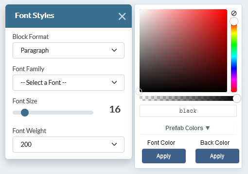
Font Styles
This pops open a dialog box that will allow you to add define heading styles, change font families, sizes, weights, colors and alignments. It is populated with the fonts and colors from your site as well as additional web-safe fonts. You may drag this around your screen so that it is handy, but out of the way as you edit.
-
</> - HTML View Opens a window that shows that editable area’s HTML and allows you to edit it manually. You cannot add < script > tags, but you can add almost anything else.
-
••• - More Features
On narrow screens, this is where things that don't fit on the main bar will reside. The smaller the screen size, the more items that will sit in this section.
Font Styles window
The font styles modal gives you a ton of control over styling selected text areas. This is where you set up headings as well as change the font, size, weight & color of your text.
Just highlight the text you would like to style, and change the settings in the modal window.
This window is persistent, so you can change different areas of text without having to close and reopen the window. However, you can move this modal around your screen to keep it out of the way as you edit. Just drag it by the blue bar above the
Block Format
menu. Click the
X
to close it.
-
Block Format
This is where your basic HTML block styling tags live, like <p>, <h1> - <h6>, etc.
-
Font Family
Change the fonts of your highlighted text. There are a number of web safe fonts built-in and your designer can add more in the customizer in the back.
-
Font Size
Changes font size of your text. It is measured in pixels (or px). Pretty self explanatory.
-
Font Weight
Choose the font weight you would like to use. They are set in increments of 200.- 200 = thin
- 400 = regular
- 600 = semibold
- 800 = extrabold
-
Color Picker
This is set up much like Photoshop's color picker, if you are familiar with it. -
Choose the base color (or hue) via the right slider.
-
Choose the tint (white to bright) by moving the circle on the X axis inside the box
-
Choose the shade (bright to black) by moving the circle on the Y axis inside the box.
-
The bottom slider will set the opacity (or transparency) of the element.
-
Color name
You can type in the hex value of a color or the HTML name of the color to quickly select it.
-
Prefab colors
You can add colors to the customizer in the back-end of WP and they will show in the drop-down box here.
-
Font Color
Once you've selected your color, click this APPLY button to change the color of the text itself.
-
Back Color
Once you've selected your color, click this APPLY button to change the color of the text's background (like highlighting).
When you are done editing, just close the window with the
X
in the blue window bar. You can also drag the window around the screen to get it out of your way by grabbing it in this blue bar.
Dynamic editor - insert elements
The bottom row of the Dynamic Editor allows us to insert elements that have their own parameters. Most of the buttons here will actually open panels that let us configure the element we are adding to the content area.

-
Link
This opens the INSERT LINK panel, which we will get into below.
-
Button
Add buttons to the site. You can control not only where they link to, but most aspects of their appearance.
-
Image
This opens the INSERT IMAGES panel, which we will get into below.
-
Video
This opens the INSERT VIDEO panel, which we will get into below.
-
Table
This opens the INSERT Table panel, which we will get into below. We thought about removing this as tables are notoriously unresponsive, but they are a valid way to display data in a website. Many of our customers may need it.
-
Icon
This will allow you to insert an icon from an icon library or character set like Font Awesome. You can browse visually and it will insert the icon where your cursor is, or give you the code to insert manually.
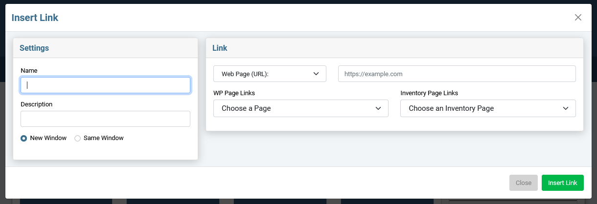
THE INSERT LINKS PANE
Click the LINK button in the bottom row of the dynamic editor to pull up the Insert Links pane.
Inserting links is pretty straightforward in the Sandhills CMS. Just fill out the form and click the green “INSERT LINK” button at the bottom of the pane.
Left Pane: settings
-
Name
This is the text that will show on the page that is the link. It is the text in between the opening and closing A tags. If you have highlighted any text before clicking the link button, it will be populated for you.
-
Description This adds a title tag to the link for SEO.
-
New / Same Window Selecting “New Window” adds the target=”_blank” to the link and will open the link in a new tab when clicked. Be aware that due to the iframe that the editor sits in, if you click a link while logged in, it will not open in a new page. You must log out to test that the New Window functionality works. Or just look at the HTML using the
< / > button.
right Pane: link
-
Type of Link
Choose which type of link you want to add. You can choose Web Page (URL) , Email Address , or Phone , depending on the type of link you would like to add.
-
URL / Email / Phone field
This is the field that will add the data between the quote marks in the <a href=” ”> .
-
URLs:
You can use a relative path to another page on your site or use the full file path ( https://....com ) to link anywhere on the web. If you are linking outside of the site, be sure to add the https:// .
-
Email:
Clicking one of these links will open a new email to the designated email address in the user's default email client. Just type in the email address and the editor will add the necessary tags. Be aware that this functionality relies on an email client being set up on the user's machine.
-
Phone:
This isn't strictly necessary as most modern browsers recognize phone numbers. However, it's a good idea to remove all doubt and designate phone numbers to make sure they are recognized and clickable. Just enter the phone number you want dialed and the editor will do the rest. Be aware that this functionality relies on the user's machine to make the phone call.
-
WP Page Links
This is a list of pages in WordPress to make internal linking easier. Choose one from the list and it will enter the correct URL for you.
-
Inventory Page Links
This is a list of inventory pages or links that were set up in the Inventory Links tool in the back-end. Use it to link to any inventory URL that is set up in the back. The select list is populated by the links' titles.
Inserting Buttons
Click the BUTTON button in the bottom row of the dynamic editor to pull up the Insert Button pane.
Inserting a Button can be as simple as complex as you would like. There are only a three things necessary to make a functional button: the content (or text) of the button, the link it goes to, and some sort of style.
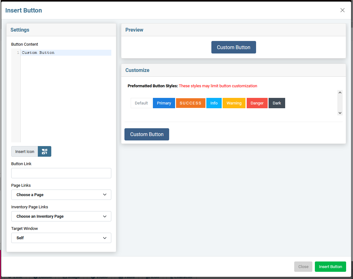
Left Pane: settings
-
Button Content
This is the text on the button itself. Just type in the text you want displayed in the button. This also includes the code for the icons used in the buttons if you would like to add an icon. The icon code is displayed in this pane so that you can control the placement and style if necessary. You will see your changes reflected in real time in the Preview pane on the right.
-
Insert Icon
This adds an icon to the button text. It will actually add the icon code right where the cursor is sitting in the Button Content field. You can add as many icons as you like.
You will only see the code in the Button Content window, the the icon itself will be displayed in the Preview pane on the right. You can move the icons around by rearranging the order of the code in the Button Content field. Be sure to move the opening <i> and the closing</i> tags together (see image below for examples).
-
Button Link
This is where you enter the URL you want your button to resolve to. If you are familiar with HTML, this will be data inside the quote marks in the <a href=” ”> . This field does not have email or phone options, so you'll have to add that onto your URL if that is the type of link you're looking for.
-
Page Links
Give s a list of pages in WordPress. Choose one from here and you don't need to add a URL to the Button Link field.
-
Inventory Page Links
Give s a list of the names of Inventory Links set up in the back end of WordPress. Choose one from here and you don't need to add a URL to the Button Link field.
-
Target Window
This determines whether the button opens the link in a new window or not.
-
Self
= Same window. Use this for links that point to other
pages inside your website
.
-
Blank
= New window. Use this for any link that
goes outside your site
. The are also a good idea for links to documents on your site, like a PDF or Word Doc.
The idea behind opening links in a new tab is that when your user gets the info they need and closes that tab, your website is still right there and they can continue their browsing session.
Top right Pane: Preview
This is just a preview of what your finished button will look like to reference as you customize the settings.right Pane: customize
-
Preformatted Button Styles
Your designer will likely have set up some styled buttons for you in the back-end of the editor. Those buttons will display in the list here.
Just click one, and that styling will be added to your new button. Once you click, you will see your changes reflected in the Preview pane. You will still need to set the text and the destination link in the Settings pane on the left.
-
Custom Button
When you click the CUSTOM BUTTON , it will open up the panel that holds all the button settings.
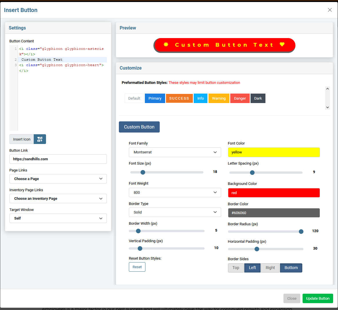
There are all sorts of settings to play with. As you adjust those settings, the button in the Preview window should update in real time. Don't hesitate to play around until you are happy with the Preview, as that is exactly how your button will look on the page. The screenshot below is an ugly, but illustrative view of a custom button.
-
Font Family
Choose the font for the button text.
-
Font Color
Choose the color of the button text. Can use HTML default color names or a #hexvalue.
-
Font Size
Size of the button text.
-
Letter Spacing
This will allow you to adjust the space between characters in your button.
-
Font Weight
Whether the button text is bold or not.
-
Background Color
This is the main color of the button itself.
-
Border Type
Solid, dashed, etc. It defaults to NONE, so you have to choose a border type (usually Solid) for the other settings to kick in.
-
Border Color
Color of the button border.
-
Border Width
Thickness of the border, as measured in px.
-
Border Radius
The curve of the button corners. Make the setting high to make a pill-shaped button.
-
Vertical Padding
Amount of space between the top and bottom of the button and the text. (usually smaller)
-
Horizontal Padding
Amount of space between the left and right of the button and the text. (usually larger)
-
Border Sides
Choose which sides of the button have a border. This can add a 3D look, depending on how it is set up.
-
Reset Button Styles
Resets all the values back to the simple blue "Custom Button" at the top of the form. It is there in case someone gets a little lost in all the settings and wants to start over.
Click INSERT BUTTON at the bottom of the screen and you are done! Your new button will be inserted where your cursor had been positioned.
WORDPRESS MEDIA & THE Sandhills INSERT IMAGE PANE
Both the Sandhills CMS and the WordPress editor use the standard media functions built into WordPress. As such it really doesn’t matter where you add your media files. If you like the standard WordPress Editor, use the backend tools. If you’re editing a page and need to add a photo, use the Sandhills CMS. Either way they end up in the same big pot of photos.
WORDPRESS MEDIA LIBRARY
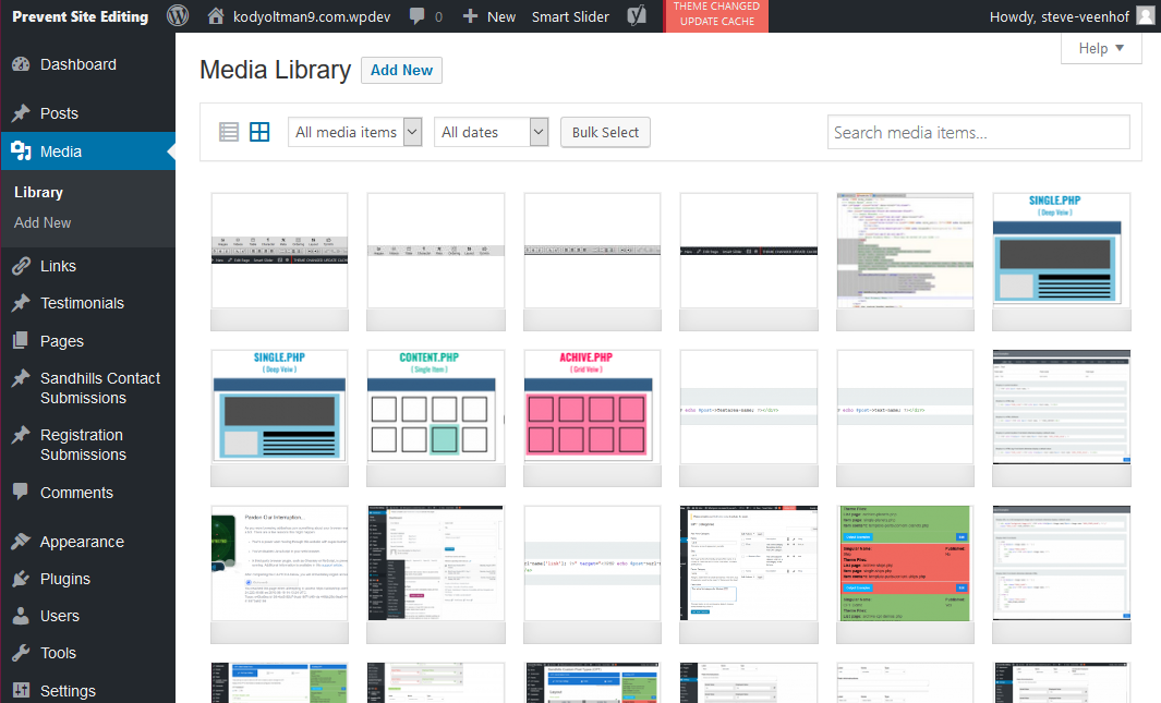
All media file are stored in the MEDIA > LIBRARY tab in the back of the site. From here you can add new files or manage existing ones. The files are displayed from newest to oldest by upload date, so the photo you just uploaded should always be in the upper left corner of the table.All media files (Photos, PDFs, and .mp4 movies) are displayed in a grid in the main pane of the Media page. Each image does have it's own settings pane as well. Just double click the image and the Attachment Details window will pop up. This is where a lot of the magic happens.
Managing Photo Settings in the WordPress Attachment Details Pane
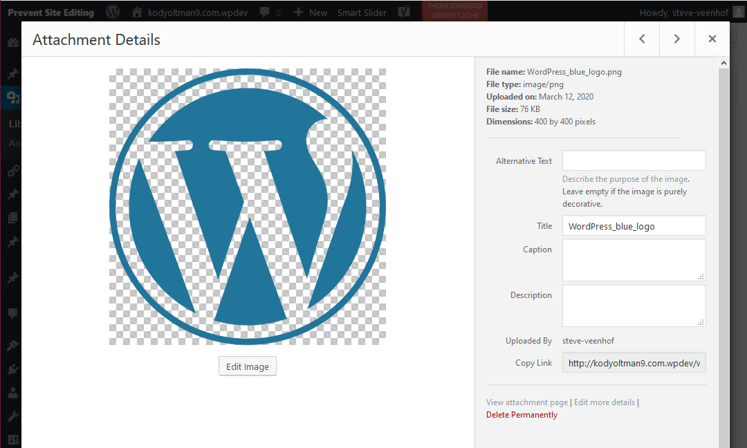
WordPress has some really nice photo functions built in. If you click the EDIT IMAGE button, you can actually scale the image down to fit your container and WordPress will re-save your file to be a lower image size and still leave the original intact. In fact, one of the quirks of WordPress is that it treats images like they are posts. That means they can be used anywhere on the site, but they can also be their own stand-alone page.
Image Details
There is some good info at the top of the right pane. The most useful pieces are probably the FILE SIZE and the DIMENTIONS. WordPress never overwrites an image, so sometimes you may have several images that look the same in the folder. This will help you determine the size and date uploaded to make sure you are selecting the right image.
Most of these values are valuable for SEO. When any value is set back here, every time you place the image with the CMS editor it will prepopulate with this setting.
Copy Link
This is the easiest place to find the URL for your image to manually insert it anywhere in the files or on the site.
We recommend only copying the relative path, not the full absolute path. ( Only use the part from "/wp-content/..." back instead of using the absolute path with the URL added "
There really aren't many more details, but it's a larger interface to edit the settings above.
This is how you remove an image from the Media Gallery. Just click the button and confirm you want to delete it.
SANDHILLS MEDIA MANAGER (Insert Image Pane)
Uploading Images
Uploading Images
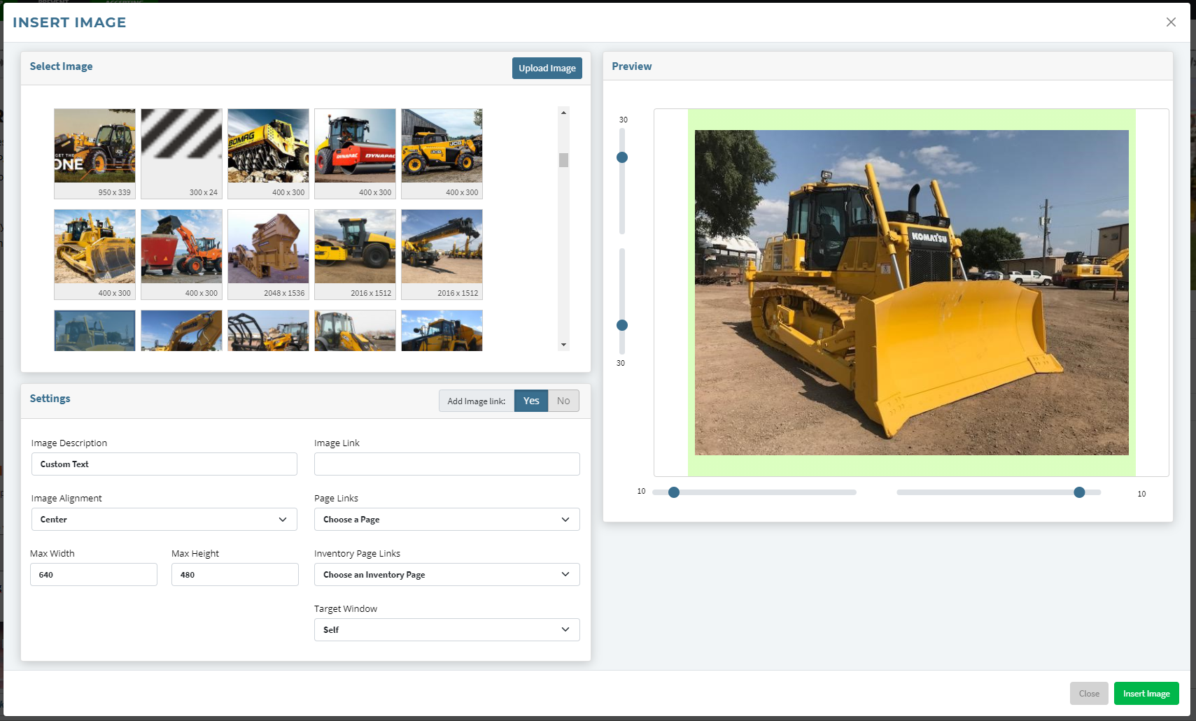
IMAGE SETTINGS
Click on the image you would like to add to the page from the AVAILABLE IMAGES pane. There are thumbnails of the images and the image dimensions to help you select the correct one. Once you click on an image it will show up in the preview on the right side of the settings pane. To change images, just click on a different image in the AVAILABLE IMAGES pane.
Once you have the correct image selected, you can fill out the settings. These add the CSS to the image so that it is styled correctly on the page. This isn’t an exhaustive range of options, but should handle 90% of what customers actually use the editor for. Below is a list of the options and how to use them.
-
Descriptive text for search engines This adds alt text to the image. It is here mainly for SEO, but is also used by screen readers or is displayed if the image can’t be found. You can type anything you want in here.
-
Width / Height These are bound together. If you change one, the other will recalculate. These are max-height / max-width tags, so the images will still scale down on smaller screens.
-
Alignment Left, Center, Right. These will add float:left; float:right; and margin:auto; style tags. The lock picture and the text will show customers how the text will react to the image for the different settings.
-
Margins Margins can be added to any side of the image independently by typing the number of px in the boxes on the corresponding side of the image preview. If someone chooses center alignment, the left and right margins will be set to “auto.”
Inserting Hosted Video Files.
WordPress will actually treat Videos like images. You can upload them through the media manager and insert them into the webpage just like they were a photo. However, WordPress does not do ANY video conversion for you, so make sure it’s a widely supported format before you upload it. Currently the best bet is an H.264 encoded MP4. Click this link to find out what the current standards are for video and which browsers support them. https://caniuse.com/#search=video%20format
Video in Background Elements
If you want to use video backgrounds, you can upload them via the media manager and get the URL for the video in the backend WordPress Media Manager. Then you can use that URL in your CSS class that sets the background video. You can set the class with your background on the element by setting it manually in the template, calling the class with the background widget, or adding it directly in the HTML inside the widget itself.
INSERT VIDEO PANE
We use YouTube and Vimeo video for a myriad of reasons, but the big one is just ease of use. Video is fairly complex and resource intensive to manage on the server itself. YouTube and Vimeo do a great job of converting all video types to web-friendly formats and serving the correct format based on bandwidth and device screen size. Plus it’s fairly easy for our customers to work with. Just seems to make sense.
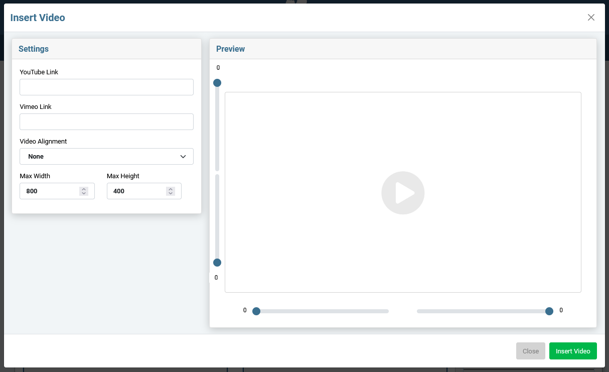
Settings Pane
-
YouTube Link
Paste the SHARE LINK form Google here. (see below)
-
Vimeo Link
Paste the video's URL here.
-
Video Alignment
Choose how the video sits in the page. You can choose Left , Right , Center , or leave it undefined.
-
Max Width
Give your video a max width. It will stay responsive on smaller screen sizes than specified.
-
Max Height
Give your video a max height. It will stay responsive on smaller screen sizes than specified.
Preview Pane
-
Video Preview
We show a preview of the video here.
-
Padding Sliders
Change the settings to add padding around the video. The padding will show up as a light green area. If you choose to center align the video, the sides will fill with the green padding to represent that it is set to "auto."
Adding a Video
Basically, just go to YouTube, find the video you are looking for, copy the share link...
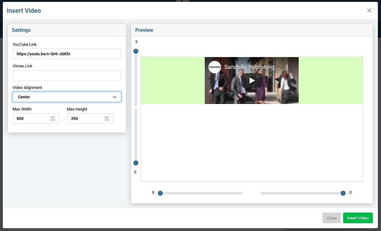
… and paste it into the YouTube Link box of the Insert Video pane. You will see a preview of the video.
Update any settings and click the Insert Video button and you’re happy!
Videos will insert inside the content area. Videos are fully responsive and will scale to fill the screen or their container by default.
If you’d like to limit the size of the video, you can set a Maximum Width or Maximum Height in the Insert Video Pane. The video will still shrink to fit it’s container, but won’t grow larger than the specified size.
INSERT TABLE PANE
Manually editing tables is usually a pain, but this tool makes setting up and maintaining tables easy.
You probably won't use tables all that often, but there are definitely times when you need an actual table to display data. The table tool works based on a selected cell in the table (the blue one). You will add additional rows and columns and even combine individual cells to create bigger areas in the table (Row Spans and Column Spans).
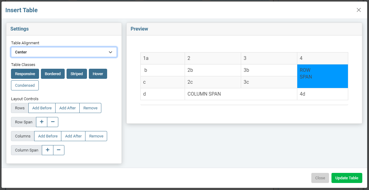
Click the TABLE button and you'll get this screen. It inserts a standard HTML table. This uses Bootstrap classes to be responsive by default. However, most of the style won't be applied to the table until you save the page and reload.
You can add text in this pane, but you won't be able to add style or media to each cell's content until the table is added to the page and you have access to the edit bars. Each cell has full editing capabilities and is independent from the cells around it. You can also insert the table blank and add all the content directly on the page.
| 1 a | 2 | 3 | 4 |
| b | 2b - left aligned |
3b - image inserted
 |
ROW SPAN |
| c |
|
3c - center aligned | |
| d | COLUMN SPAN | 4d - right aligned | |
-
Table Alignment
This is just setting where the table sits on the page (left, right, center). Responsive tables will grow to fit their container, so this doesn't have much affect on them.
-
Table Classes
These buttons add Bootstrap classes to your table that add a ton of style that makes the whole table look pretty and tells it how to display on different devices. Tables of the past were very rigid and ugly, these classes make your tables behave on modern devices, even on the small touchscreens of today's phones.
- Responsive - Makes the cells grow/shrink based on screen size. Use this whenever you can .
- Bordered - Adds the thin border around the table cells.
- Striped - Rows alternate between a color and white. You will want to define this alternate color in your stylesheet as the default is an almost imperceptible difference.
- Hover - Mouseovers highlight content in the entire row.
-
Condensed
- Minimizes default spacing around table content. Great for big tables on small devices.
-
Rows
Adds or removes rows from your table based on the highlighted cell. You can add rows above or below the active cell or delete the row with the active cell.
-
Row Span
Combines the highlighted cell with the next cell underneath it to create a larger cell. This only affects the column with the highlighted cell. This larger cell will have multiple cells in other rows to the right and left of it.
-
Columns
Adds or removes columns from your table based on the highlighted cell. You can add columns before or after the active cell or delete the column with the active cell.
-
Column Span
Combines the highlighted cell with the next cell to the right of it to create a larger cell. This only affects the row with the highlighted cell. This larger cell will have multiple cells above and below on other rows.
Editing Existing Tables
There are two easy ways and one hard way to edit an existing table.
-
You can click the
edit icon
that hovers above the table
to get back to the admin panel.
-
You can use the
table editing
buttons
in the editor. This is usually the easiest.
- You can edit it in HTML view (</> button). Sometimes this is the easiest if you know what you're doing.
Editing a table with the table editing buttons
The table editing buttons allow you to alter the structure of your tables just like the insert table window, but in real time on the page itself. It will not alter your styling or content of the individual cells. Be aware that tables are often finicky and that you have an UNDO button at the top of the editor.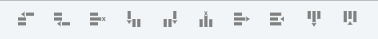
These buttons will not show in the editor until you select a table in a content area, then it will add these controls to the edit bar.
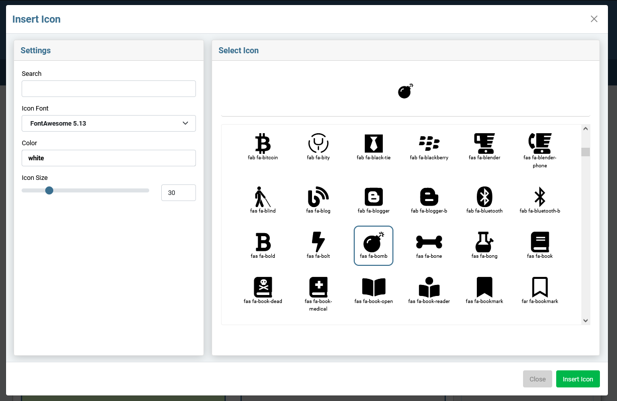
Insert Icon
This is a simple tool to make it easier to add icons to content areas. Just click the ICON button and it will pop up a window that will allow you to choose your icon and insert that icon wherever your cursor is in the editor.
-
Search
You can start typing the name of the icon you are looking for to narrow the options in the SELECT ICON pane.
-
Choose your Icon Font
Choose the font or icon library you want to use from the first select box. This will populate the display window of icons below. The tool has some popular libraries preloaded, but we can add new ones as needed. The system should work with any SVG or font-based icon library.
-
Click on the Icon of your choice
Choose the Icon you wish to use from the SELECT ICON pane on the right. When you click on an icon in display pane, it will populate a preview at the top of the window. It also gives you the HTML that you can use to display that icon if you need to insert the icon in HTML view.
-
Add a color
(optional)
Now that your icon is selected, you can add a hex code, RGB value or just the HTML color name to colorize your icon. If nothing is set, it will just be the default color of the text block it is in.
-
Icon Size
You can resize your icon with this slider or typing the px value in the box to the right of the slider.
-
Click the green INSERT ICON button
The icon will be inserted where the cursor was positioned.
Searching for an icon
Keep in mind you may have to be a little creative to get the icon you want. For example, if you search "email" you will get a limited number of icons. If you don't see what you are looking for, you may have to search for just "mail" or "envelope" to get the icon you really want.
Enabling an Icon Library.
To activate additional Libraries, go to SETTINGS > ICON FONTS
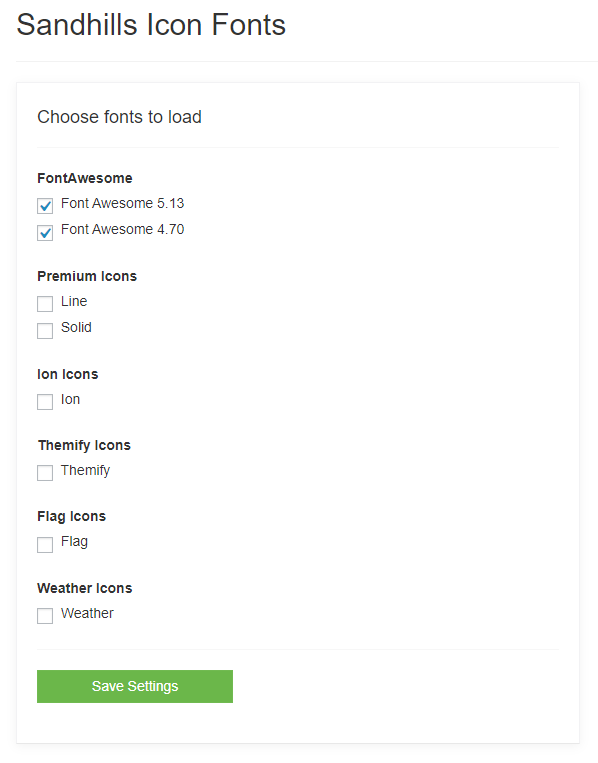 Just click the checkbox next to icon libraries you would like enable / disable and click
SAVE SETTINGS
.
Just click the checkbox next to icon libraries you would like enable / disable and click
SAVE SETTINGS
.